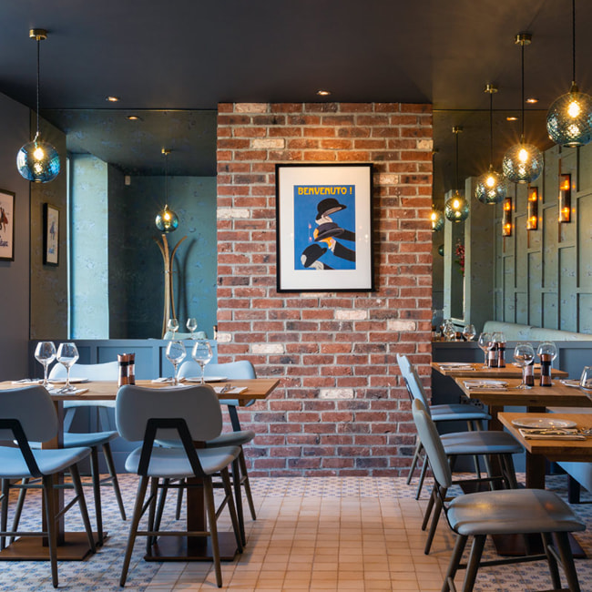
At Quattordici, the renowned Italian restaurant in London, every aspect of the experience is considered down to the finest detail — from the plate to the glass. For this reason, its wine labels are not treated merely as informational elements, but as extensions of the brand itself: a collection of distinctive, refined, collectible objects that carry the character of the space within them.
The series begins with two wines: a Merlot Veneto and a Soave DOC, representing two different expressions of Italian taste. The former is fuller, deeper and more structured. The latter is fresh, light and refined. Despite their contrasts, the labels speak the same visual language.
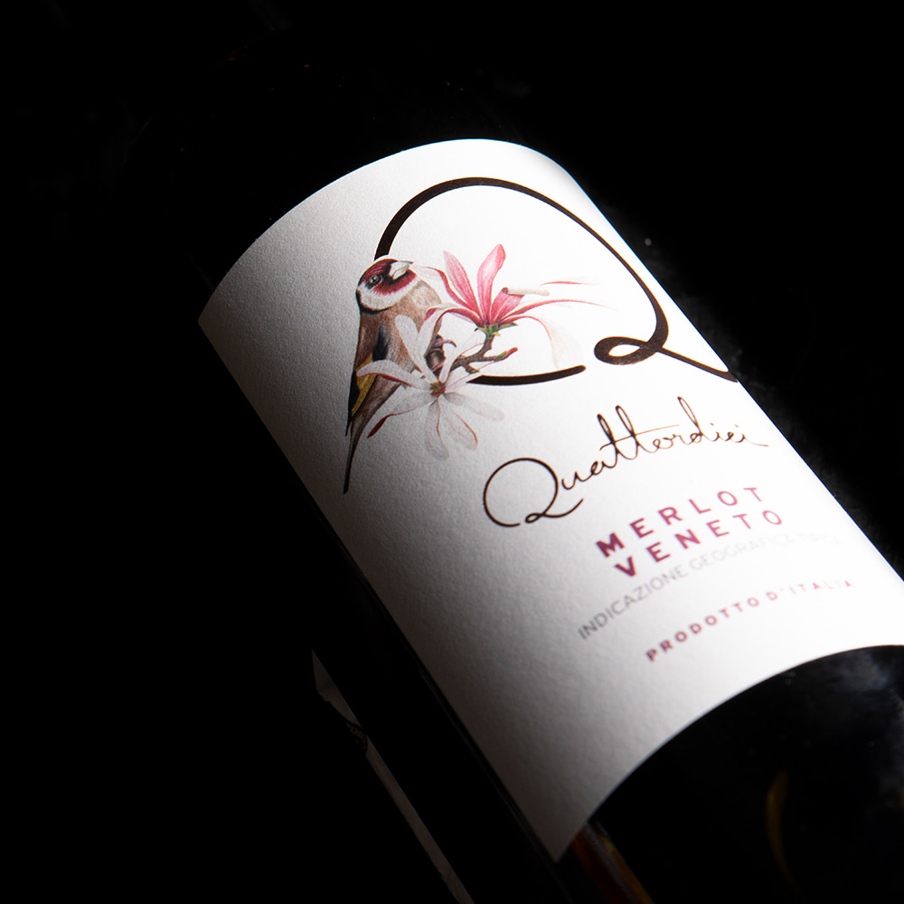
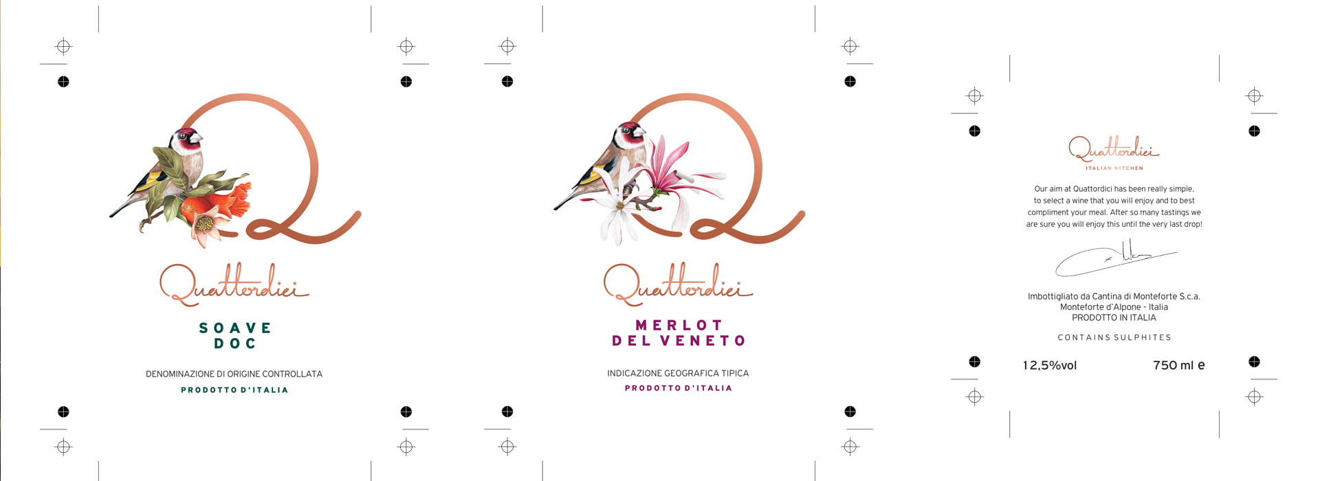
The core design element is the bold, graphic “Q,” which functions as a visual frame. It is not merely the initial of Quattordici, but an organic form that embraces a different bird and flower in each edition. In the Merlot, the palette revolves around red and brown — colors of the earth and ripe fruit. In the Soave, the result is lighter, with green leaves and pomegranate blossoms, evoking freshness and a spring – like aroma.
These small, natural details are not decorative. They are messages of mood. The restaurant’s guest recognizes that each wine has its own character and its label captures it with restraint and consistency.


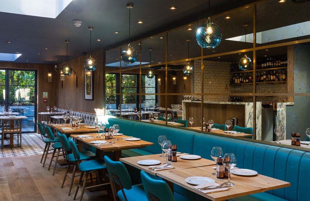
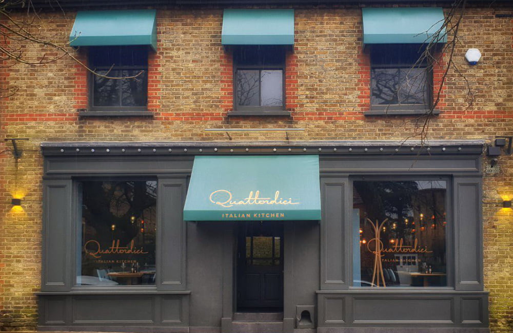
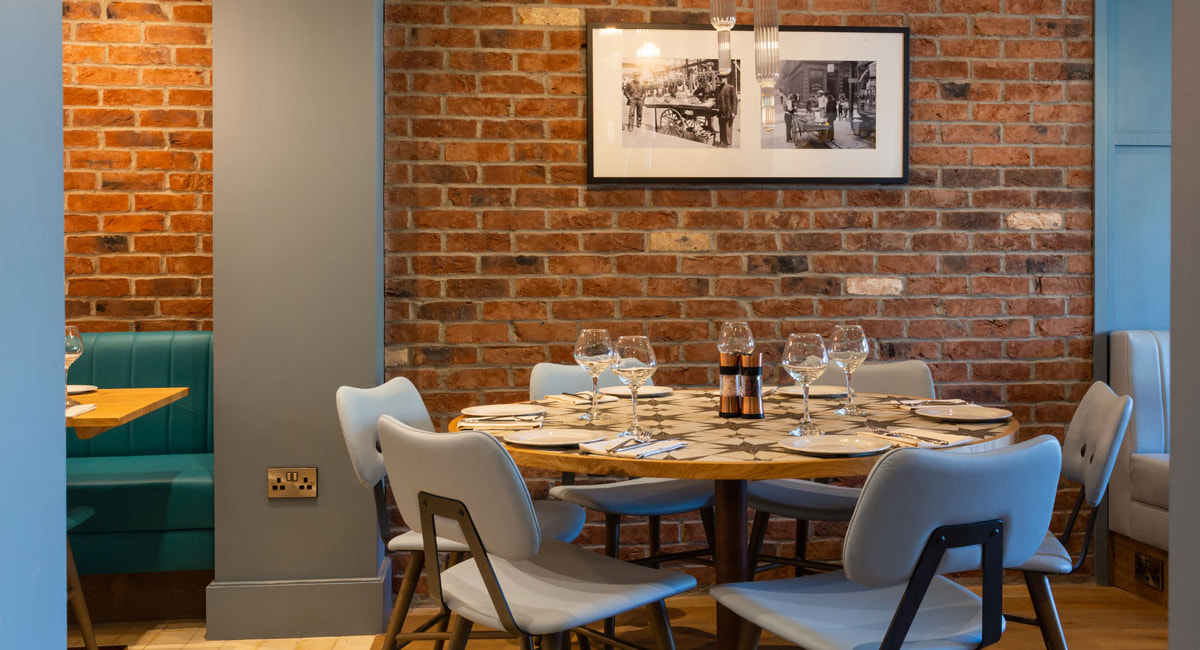

The calligraphic word Quattordici resembles a personal signature. The design conveys friendliness, care and familiarity. There are no heavy symbols or excessive graphic effects. The tone is clean, calm and confident — much like the experience offered by the restaurant itself.

The goal of the design is twofold:
1. To allow the product to stand out on the table with understated authority.
2. To serve as a keepsake of the experience—a label the guest will remember and perhaps even take with them.
The Quattordici wine series does not exist merely to accompany the dishes. It is part of the narrative. The design — restrained yet expressive — acts as a connecting link between the aesthetics of taste and the identity of the space. It is proof that when a brand speaks with coherence, every element — even the smallest one — becomes a carrier of value, character and memory.
