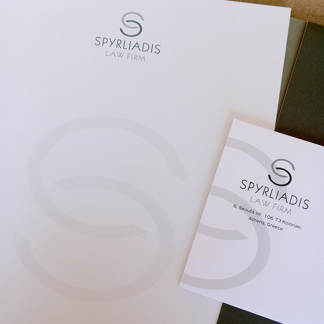
In the field of law, where every word carries weight and every detail matters, the identity of a legal firm is not limited to its people and achievements – it begins with the first impression. The logo of SPYRLIADIS LAW FIRM has been designed with the same precision and insight required to navigate complex legal matters. It is a visual statement of reliability, principles and contemporary legal thinking.
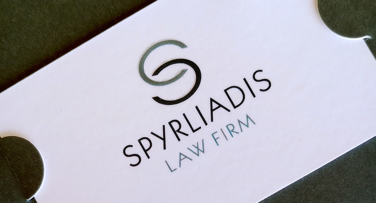
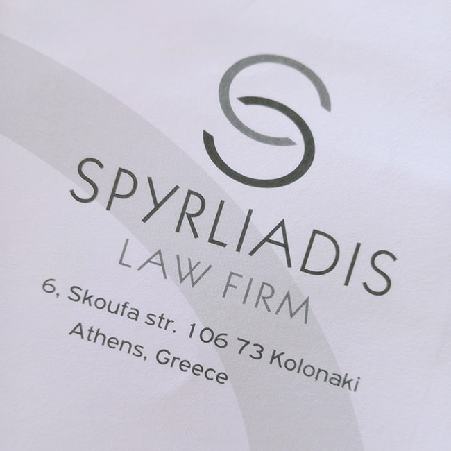
At its core stands the monoline symbol – an elegant and restrained letter S, formed by two curves moving in opposing yet harmonious paths. This choice is deliberate: the form alludes to dialogue, the confrontation of arguments and synthesis – elements fundamental to the essence of legal practice.
The “S” can be interpreted as the initial of the name Spyrliadis, but also as a timeless symbol of stability, consistency and continuity.
The curvature of the monogram does not soften its strength – on the contrary, it enhances it, showing that flexibility and adaptability are virtues in the contemporary legal environment. The circular form enclosing the “S” refers to wholeness, protection and unity, elements that translate into a holistic approach to legal representation. The typography of the logo, with clean and symmetrical lines, conveys rigor without rigidity. The name SPYRLIADIS in uppercase communicates authority and structure, while the subtitle LAW FIRM, in a more understated style, clearly states the field of practice without overshadowing the brand.


The contrast and hierarchy in the typography reinforce a sense of order and clarity.
The color palette, in shades of grey, has been chosen with care: it is a color that does not seek attention, but inspires trust, professionalism and neutrality. In a field where composure and clear thinking are fundamental values, grey becomes the ideal “canvas” on which the seriousness of the work can stand out. The logo of SPYRLIADIS LAW FIRM does not shout – it reassures. It does not aim for an impressive first glance, but for the lasting trust built through consistency, ethics and deep knowledge of legal reality.
It is an emblem that represents a law firm placing the client at the center, approaching every case with responsibility and granting justice the respect it deserves.
Through this discreet yet meaningful visual mark, SPYRLIADIS LAW FIRM presents itself as a modern legal ally. Steady. Uncompromising. With its gaze set on the future of justice.
Legal science demands precision, clarity and reliability. These very values are reflected with absolute consistency in the corporate identity of Spyrliadis Law – a law firm that combines the depth of legal knowledge with the discreet elegance of contemporary design.
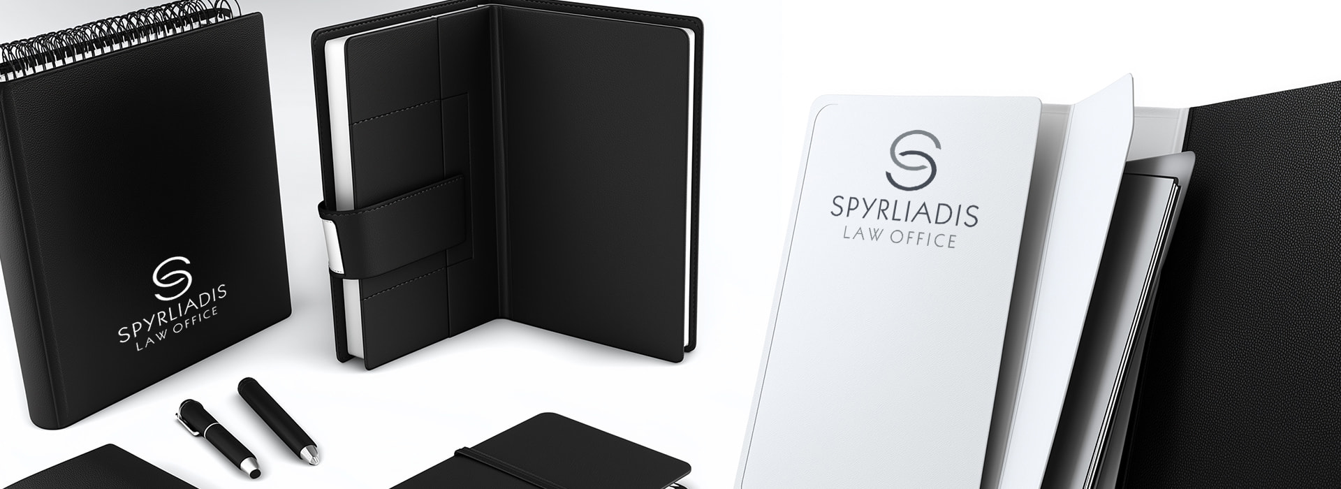







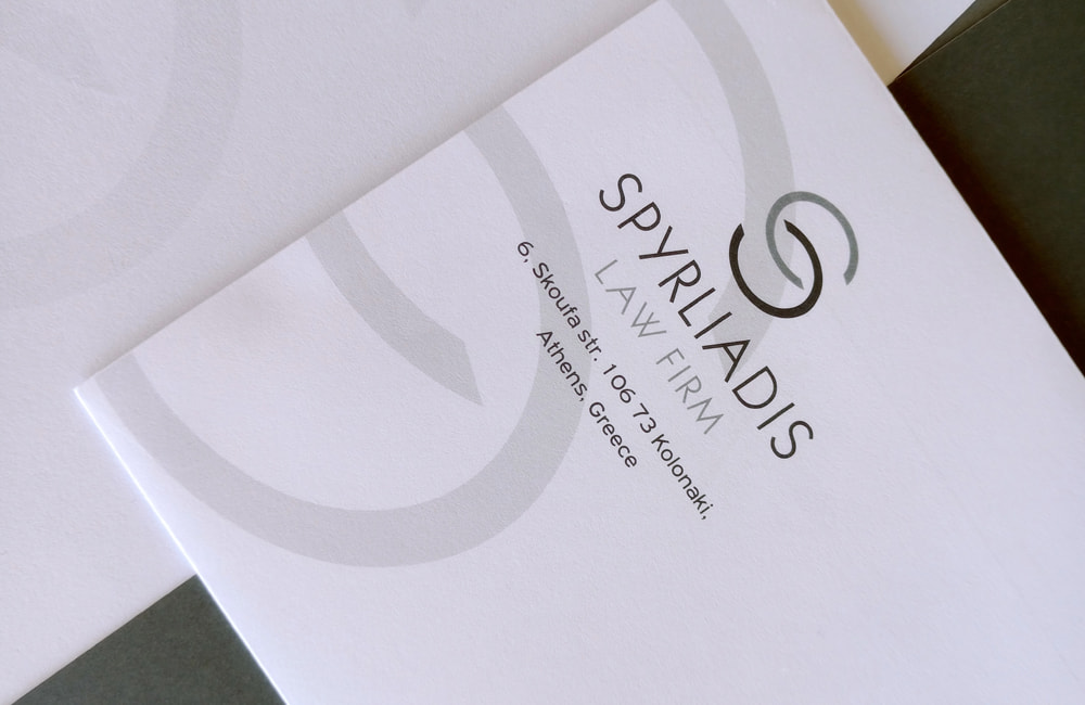
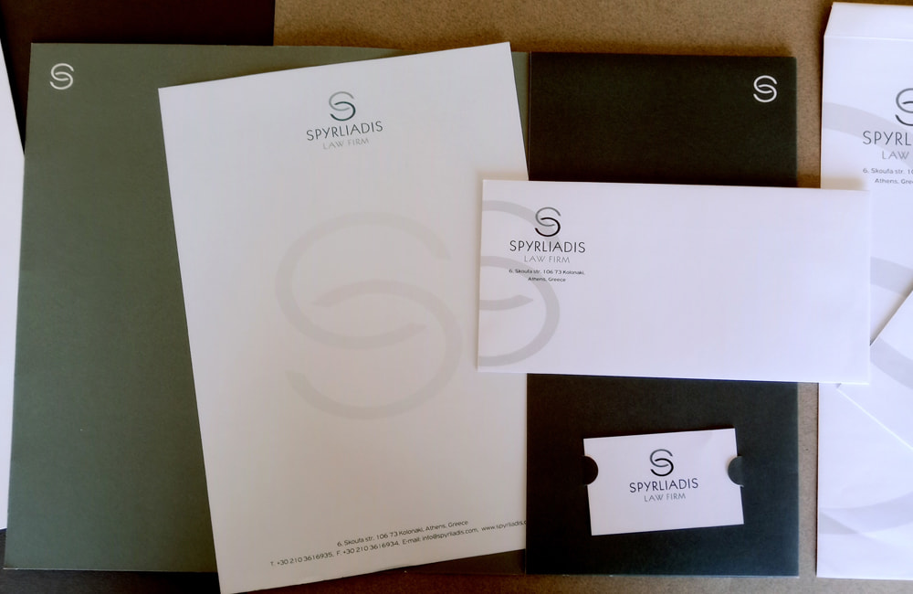
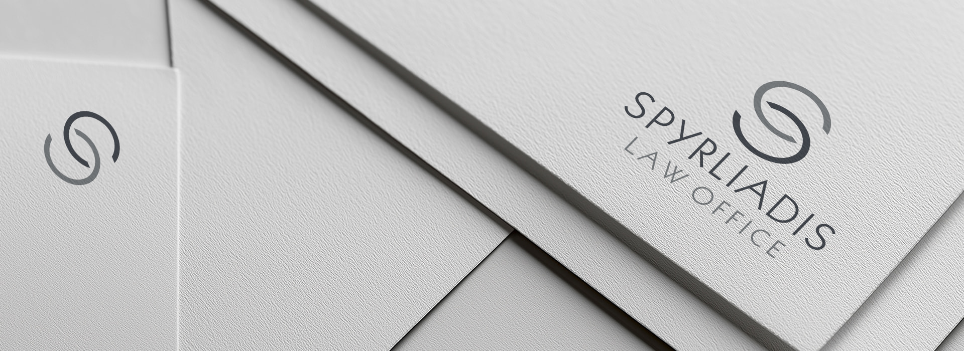

The visual language of the brand is built on a minimal and linear aesthetic, reflecting the way the firm approaches the legal field: with clarity, strategic thinking and substance. Neutral grey tones, arranged in harmonious gradations, suggest balance, stability and objectivity – fundamental concepts in every legal case. At the same time, they convey the composure and authority that define the handling of complex and demanding matters.
The typography, elegantly restrained, modern yet with depth, reinforces a sense of seriousness and professionalism without becoming distant or inaccessible.

The use of uppercase letters adds gravitas, while the clean design of the logo conveys technical excellence and legal precision – not as affectation, but as the company’s internal DNA.
Spyrliadis Law does not settle for merely adhering to legal standards; it redefines the way a law firm communicates its identity. Through a branding system that avoids excess and ornamentation, it projects its core message: integrity, reliability, adaptability and trust.
This corporate image was not designed to draw attention – it was designed to hold the steady gaze of the partner, the client, the individual seeking legal guidance with responsibility and empathy.
At its core, the corporate identity of Spyrliadis Law is a continuation of the way the firm itself operates: with respect for tradition, attention to detail and, at the same time, a clear orientation toward the future of law and the evolution of legal practice.
It is proof that even in the world of justice, aesthetics have a place – when they serve substance.
