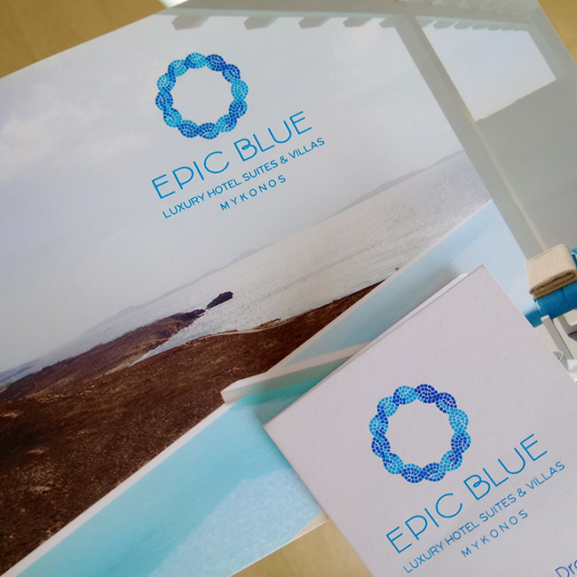
No beginning is more compelling than one born from light. In a place where blue is not a color but a sensation, where the horizon dissolves into the silence of the sea, Epic Blue Suites & Villas interprets hospitality as an art and luxury as an experience of inner balance. And this philosophy unfolds intelligently through a logo rich in movement, symbolism and energy.
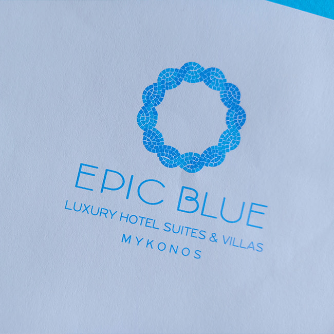
Its circular form, composed of mosaic patterns in shades of light blue, cyan and deep sea blue, resembles the outline of a sun or a wave, carrying the rhythm of a breath.
The choice of mosaic is not decorative — it is cultural. It brings references from traditional Cycladic floors and wall compositions into the contemporary era, underscoring Epic Blue’s connection to the authenticity of the island landscape.
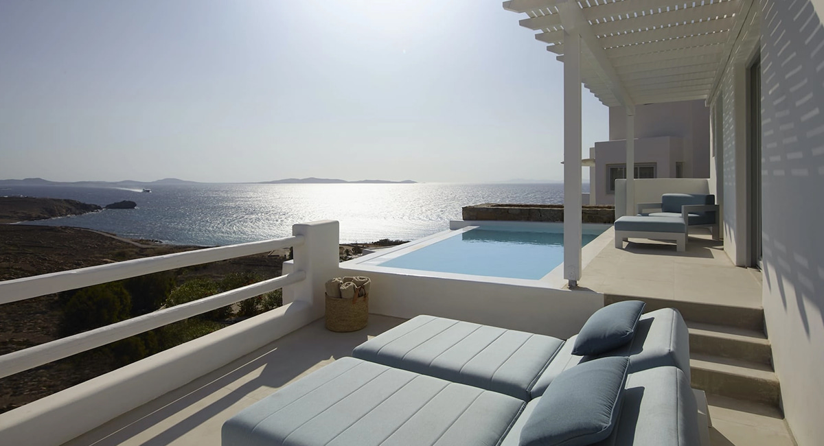
Blue here is not singular. It is multiple and layered. A blue that follows the gradient of the horizon when viewed from an infinity pool. A blue that mirrors the early morning sky, the sea as it deepens and the visitor’s gaze as it finds calm. This blue does not impress—it envelops. It invites you to step into it.
The curves and perfect symmetry of the pattern give the design flow and balance, creating the sense of an experience without beginning or end — like a feeling that stays with you even after you leave. The symbol resembles a wreath or a piece of jewelry, a circle open to imagination, light and movement.
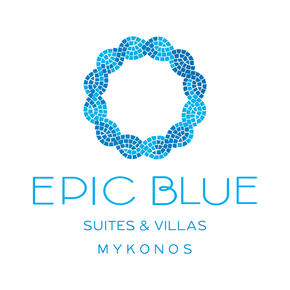
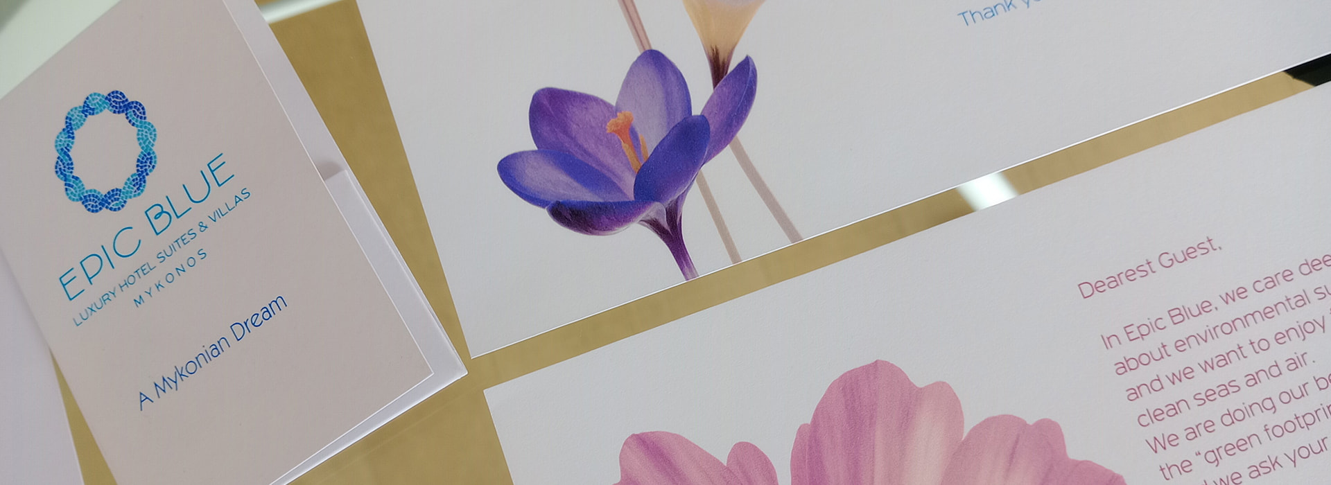
The typography of “EPIC BLUE” follows the same philosophy: clean, modern, with geometric letterforms and absolute clarity. It is a voice that needs no volume. Contemporary and subtly bold, it carries a quiet confidence that does not impose itself but radiates. The parallel reference to “Suites & Villas” and “Mykonos,” set in refined, understated typography, completes a visual statement that does not try to say everything — it leaves space for you to feel it.
The entire aesthetic proposal of the logo captures what Epic Blue truly is: a place where elegance does not shout but is implied∙ where luxury is not limited to amenities, but transforms into an emotional experience. An environment where every curve, every tone and every breath of light has been designed to embrace the guest with care and style.
And when you look at this logo, you feel something very specific:
that blue can, indeed, become epic.
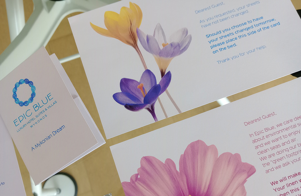
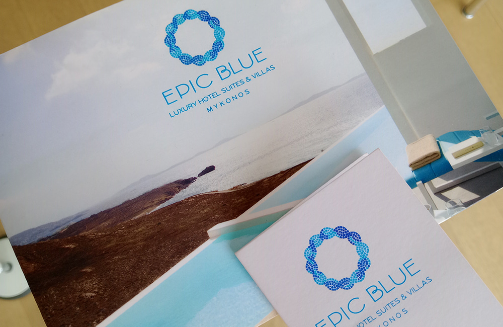
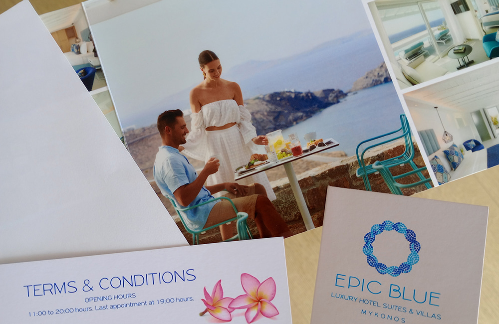
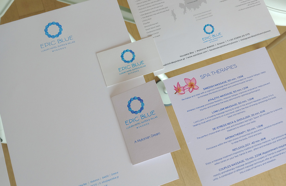
The corporate identity of Epic Blue Mykonos is not merely an aesthetic decision. It is the embodiment of an experience — the visual expression of a world where the sun, silence and the Aegean create a space of calm, pleasure and refined hospitality.
The name Epic Blue does not promise color alone — it promises a state of mind. Blue, archetypal and Cycladic, becomes epic here because it is not static· it is alive, deep, boundless, shifting with the light of day. The corporate identity was designed to capture exactly this: simplicity that moves, purity that fills and silence that is not empty, but full of presence.
The logo, with its circular formation resembling a wreath made of marine structures, coral or droplets of water, symbolizes cohesion, flow and an enduring connection to the landscape.
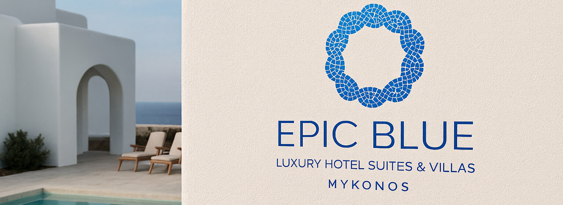
It is a symbol that refers to the natural element without imitating itity· an abstract form that blends the natural and the contemporary with balance and harmony.
The color palette revolves around pure blue, combined with white and subtle natural tones. It is a visual language that breathes. Not verbose, but transparent, clean, cosmopolitan yet deeply Cycladic. The pairing of minimalist typography with spacious layouts reinforces this sense of clarity and calm.
Every element of the brand’s presence — from business cards, welcome notes, spa menus and brochures to branded amenities—is defined by a high level of consistency, aesthetics and simplicity. The selected imagery does not merely showcase the facilities· it tells experiences: the silence of a private pool, the breathtaking view from a suite, the light flooding the room and dancing on the water.
The overall identity of Epic Blue is not built on showy luxury· it is grounded in the true essence of hospitality: offering space, clarity and room to breathe. Design becomes a tool of trust—it conveys the promise of an experience that is authentic, calm and perfectly balanced.
Epic Blue is not “just another hotel in Mykonos.” It is a Cycladic state of calm, expressed through the brand’s identity with consistency and sensibility. Its corporate image—in every application, every surface and every detail—narrates an experience of serenity, light and contemporary island luxury, without noise and without excess.
