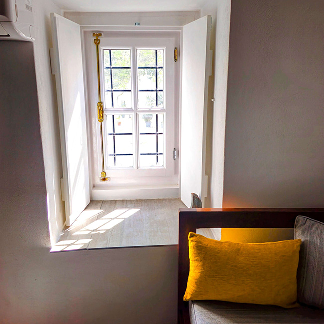
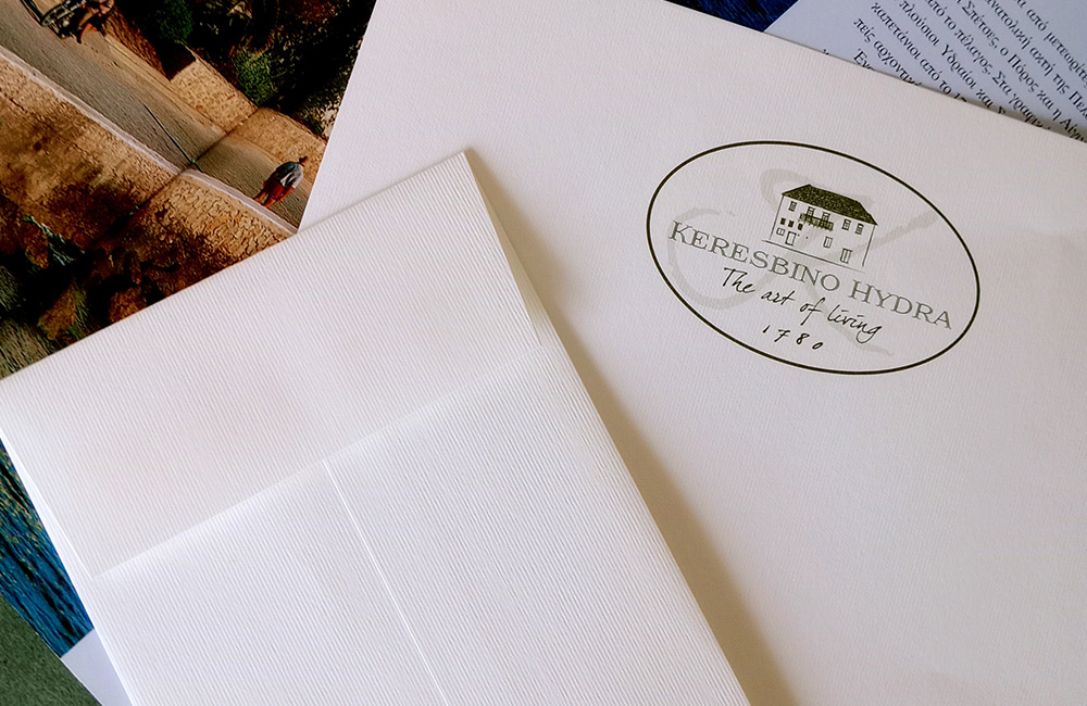
If anything reminds us that time can be a friend rather than an enemy, it is a stone mansion standing proudly by the sea since 1780. Keresbino Hydra was not built to impress. It was built to live, to endure, to host. And its logo does not function as a commercial mark, but as a subtle reminder of a way of life that fades with time – and that here, is rediscovered.
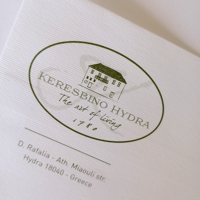
At the center of the composition stands a linear illustration of the mansion: austere, symmetrical and proudly restrained. A structure that speaks of Hydriot architecture, of the intelligent simplicity of seafaring merchants and of the relationship between people and light, land and view.
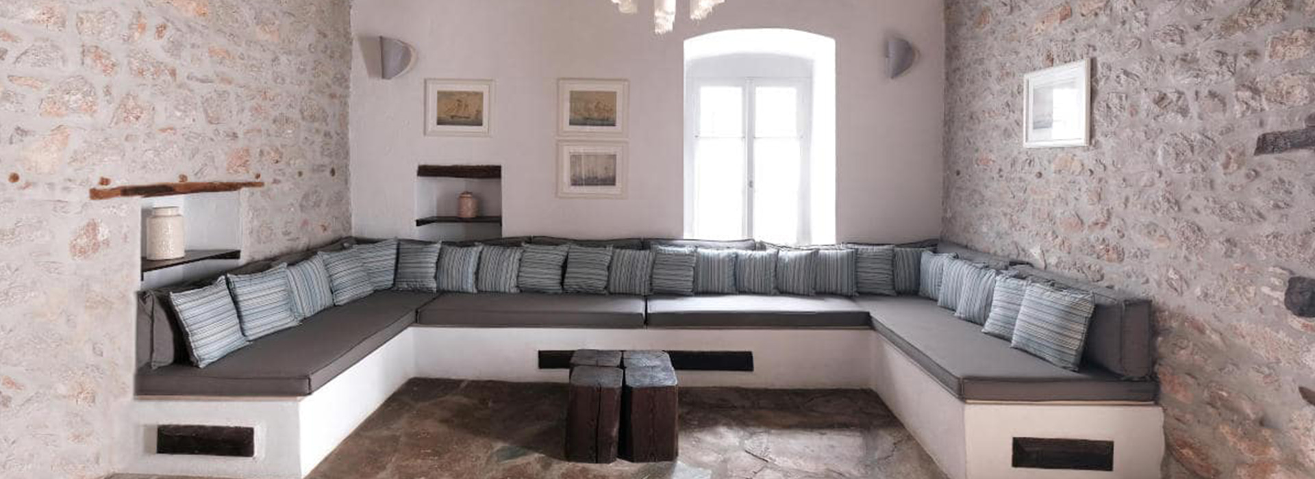
The name “Keresbino”, derived from the word “keras” or “stone” – the foundational material of its existence – is set in an elegant, traditional typeface, carrying the quiet confidence of things that have no need to prove anything.
Directly beneath, in handwritten, unpretentious calligraphy, unfolds the phrase:
“The art of living.”
Not “luxury living”, not “experience”, not “escape”.
But art. The art of living with simplicity, with continuity and with meaning.

The hand that writes this phrase feels as if it comes from a captain’s logbook or a lover’s letter – a living breath within the design framework.
The addition of the year 1780, discreet yet defining, functions as a chronicle: it does not simply tell us when the house was built. It places us within the historical continuum of Hydra – an island that does not look back out of nostalgia, but out of respect. The very form of the logo, enclosed within a subtle elliptical frame, recalls an old ticket stamp or the seal of noble correspondence – as if it has arrived from another era, yet fits perfectly into the present.

The addition of the year 1780, discreet yet defining, functions as a chronicle: it does not simply tell us when the house was built. It places us within the historical continuum of Hydra – an island that does not look back out of nostalgia, but out of respect. The very form of the logo, set within a subtle elliptical frame, recalls an old ticket stamp or the seal of noble correspondence – as if it has come from another era, yet fits perfectly into the present.
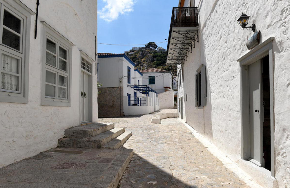
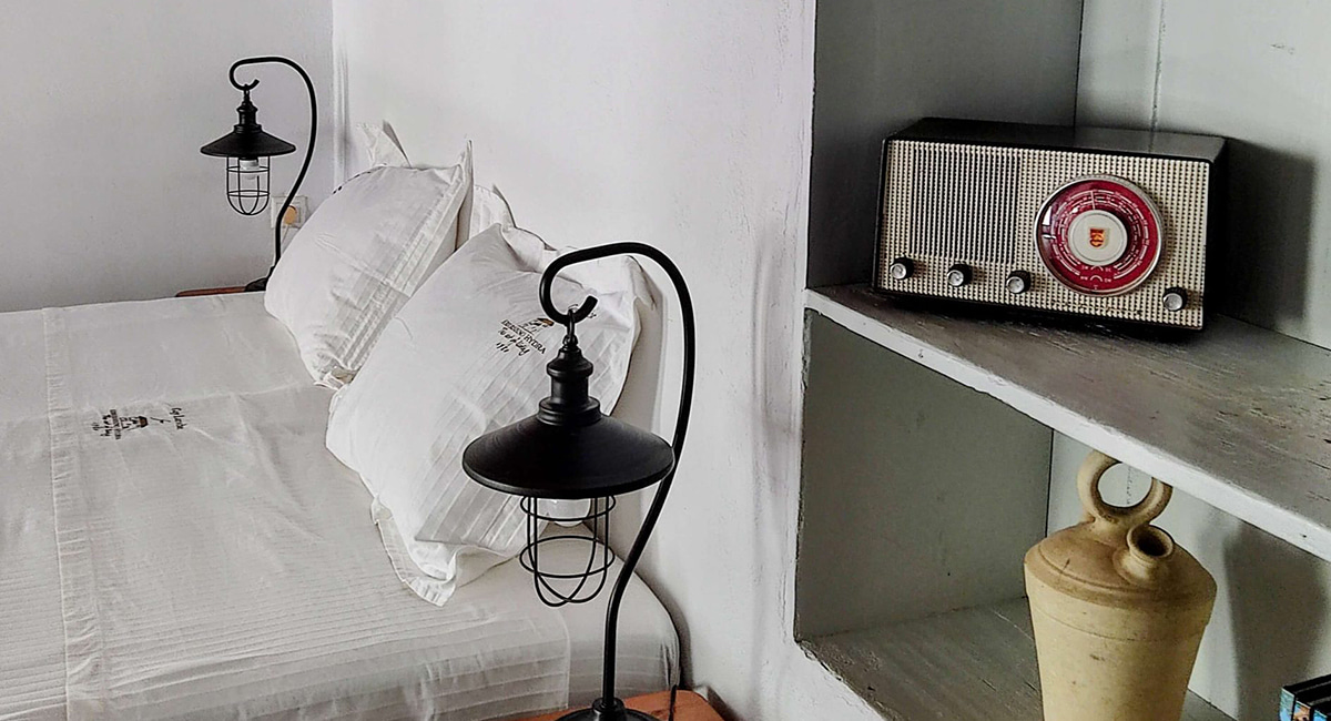
And if the “art of living” can find meaning beyond words anywhere, it is here – in a courtyard with jasmine, beneath 18th century rooftiles, behind windows that look out to the sea of Hydra and whisper to us:
beauty is about living well. Not excessively. Not quickly. But meaningfully.
