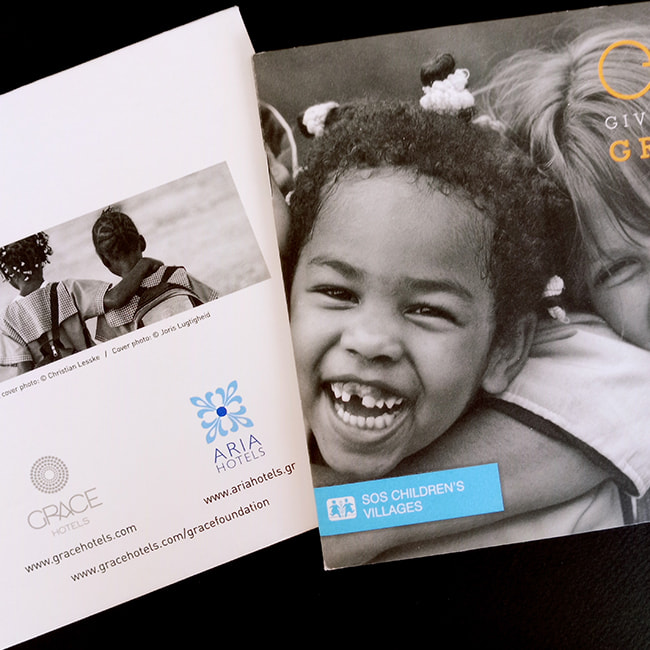
There are printed materials that serve the image of a brand. And others that serve its purpose. The Give with Grace brochure belongs to neither category on its own – because it is the union of both. It is a communication tool and at the same time a symbol of kindness, solidarity and responsibility.
The design of the brochure began with one principle: not to show only what the initiative does, but why it does it.
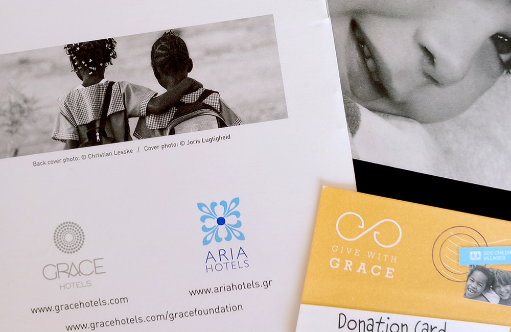
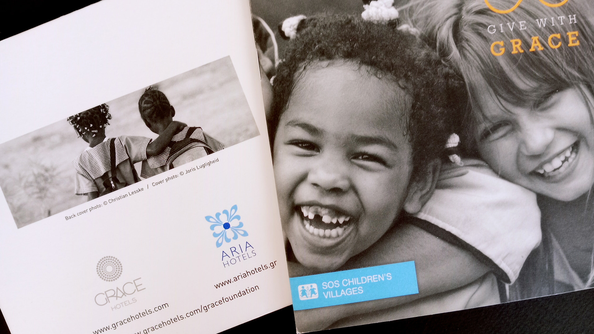
The brochure was built around an action – a gesture that is not advertised, but inspires. From the very cover, the aesthetic is honest, human and disarmingly direct. The children’s smiles, in black and white, do not ask for pity. They invite identification. They look the reader straight in the eyes.
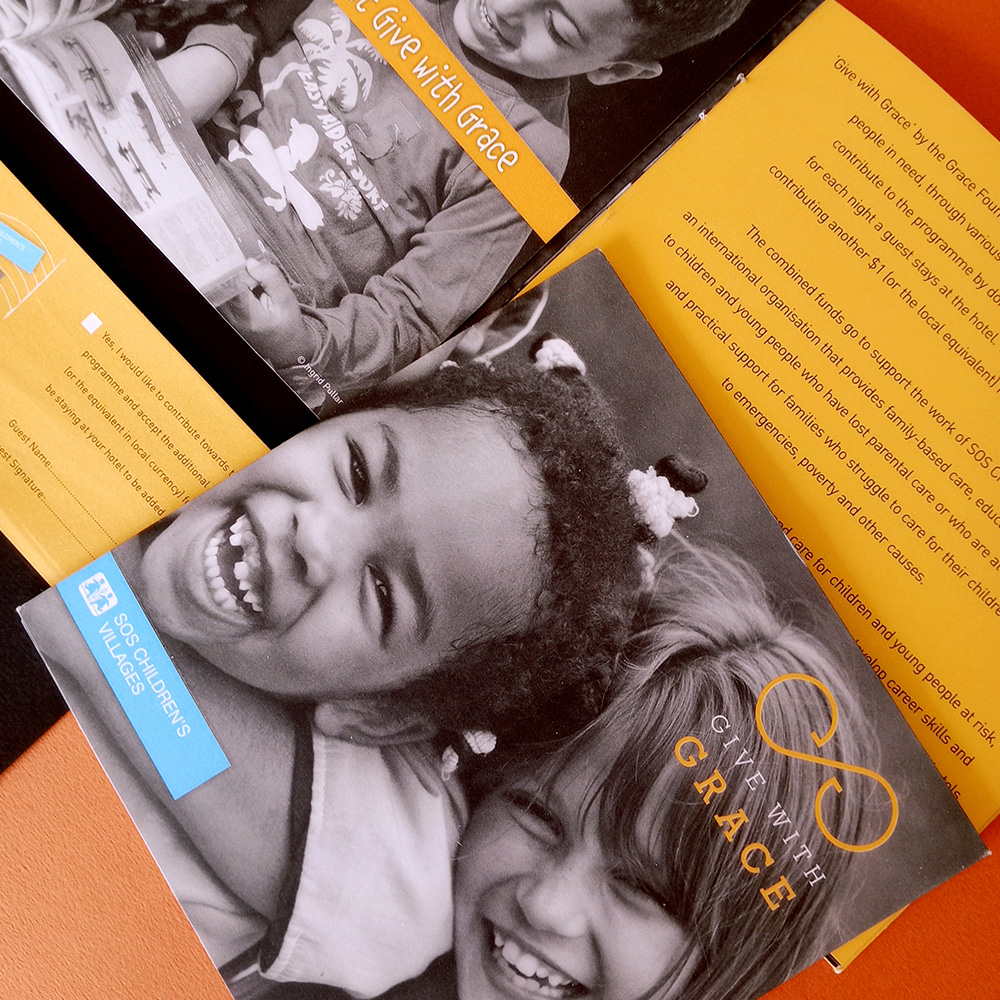
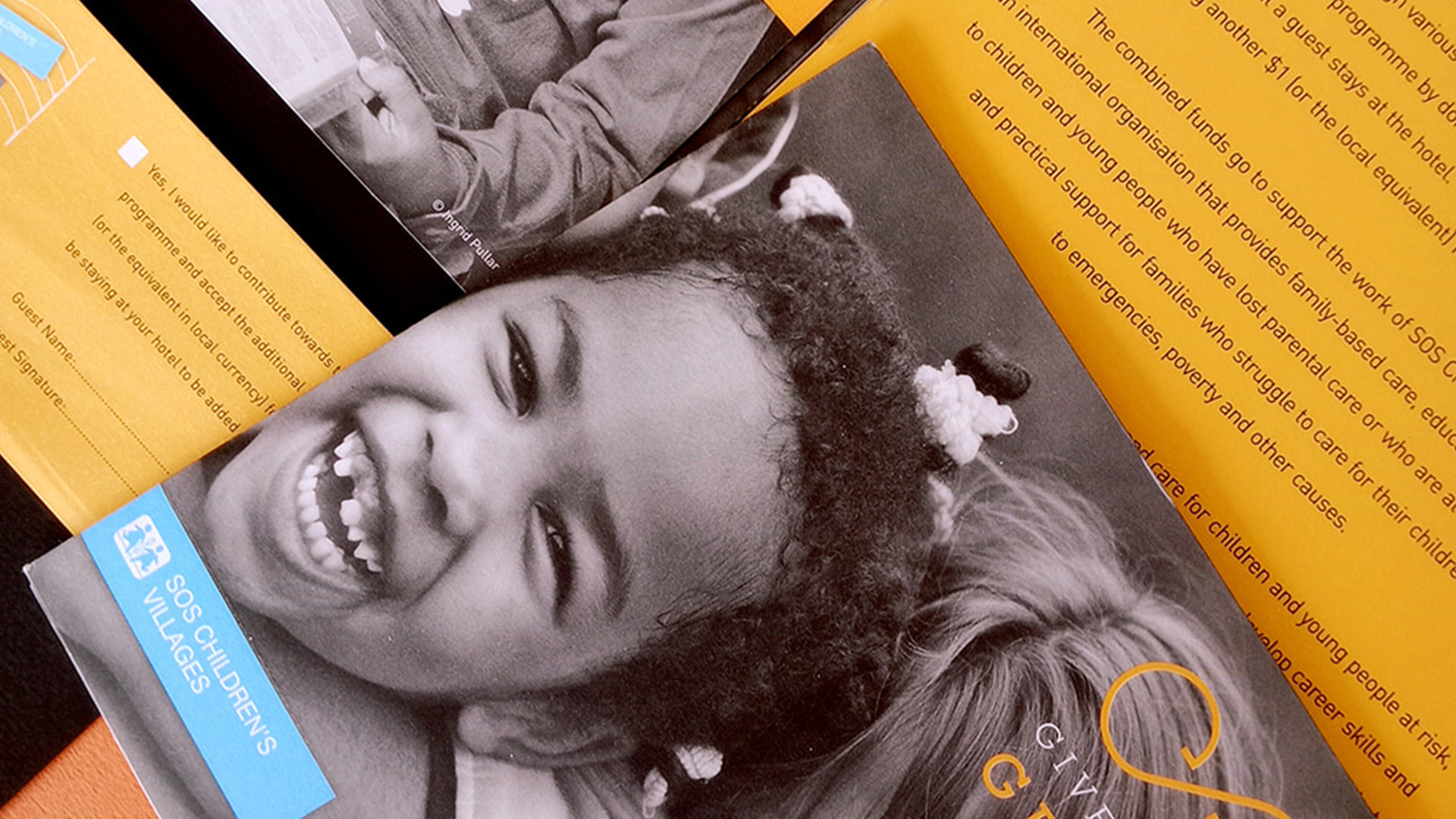
The color palette combines the simplicity of grey with vivid touches of bright yellow – like light breaking through monotony, just as giving illuminates the lives of those in need. The blue of SOS Children’s Villages acts as a bridge – a visible connection between the recipient of help and the one who chooses to offer it.
The structure of the brochure is clean, readable and emotionally intelligent. Each page builds a narrative arc through simple means: from presenting the initiative and the organizations involved, to explaining how each person can participate. Nothing is excessive. Nothing shouts. Giving, like dignity, speaks in quiet words.
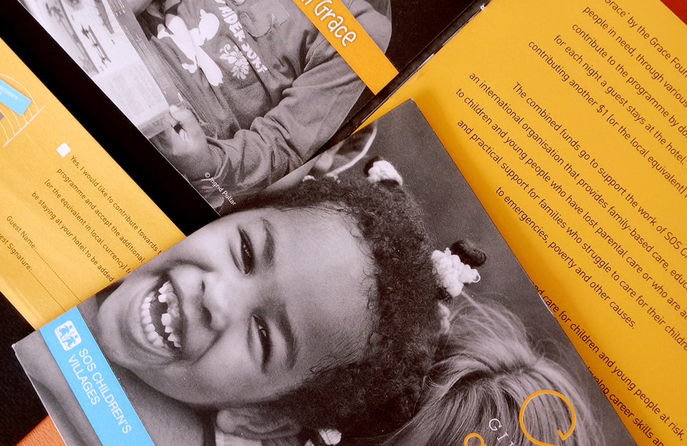
The way the initiative is presented does not rely on guilt or need. It is built on trust: the belief that kindness exists and simply waits for an opportunity to be expressed. The reader is not manipulated – they are informed with respect. And this is the power of the brochure: it turns the act of reading into an invitation to participate.
Typographically, the choices are discreet yet meaningful. The headings are easy to read, the language accessible yet substantial. The narrative unfolds at a gentle pace – like a personal conversation between two people who share a common value: the belief that the world can change, even slightly, through a conscious choice.
The Give with Grace brochure is more than communication. It is an action designed to inspire action. It is a printed form of kindness – quiet, thoughtfully crafted and full of respect. And it is proof that design, when created with substance and intention, can change the way we see, the way we feel and ultimately – the way we give.
