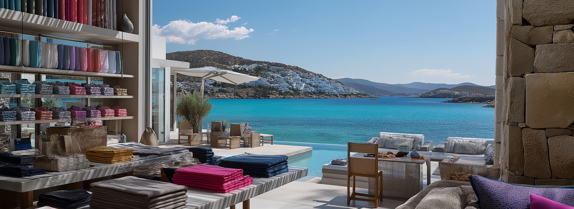
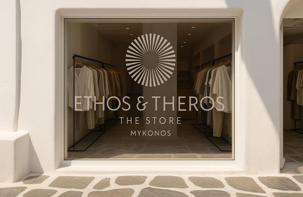
At the heart of Ethos & Theros – The Store lies an identity that conveys elegance, authenticity and a refined connection to the spirit of Mykonos. The visual mark is not merely a decorative element · it is a symbol that captures the essence of summer in the Aegean: light, energy and timeless elegance.
Its circular form functions as a metaphor for the sun, the constant force that defines the rhythm of the Greek islands.
From the center, balanced rays emerge, a composition that simultaneously evokes the brilliance of solar radiation and the geometry of ancient Greek art. This dual symbolism bridges the past with the present: a respect for cultural heritage combined with a contemporary interpretation that engages with today’s world of luxury. Typography plays an equally important role.
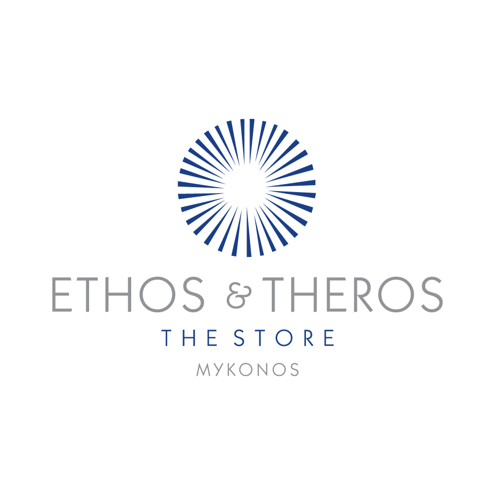
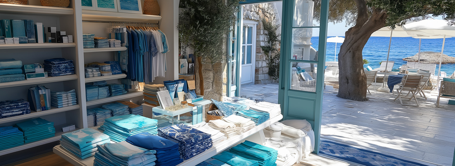
The choice of a clean, minimalist typeface conveys a sense of modernism and refinement while the combination of neutral gray tones with the deep blue of the Aegean evokes harmony, clarity and understated luxury. This color palette enhances the flexibility of the identity, ensuring that the mark remains striking and timeless in every application – from the store signage to high-end packaging.
The name is not merely a commercial identity · it expresses a philosophy. Ethos speaks of values, authenticity and character while Theros conveys the brightness, warmth and liberating energy of the Mediterranean summer. Together, they form a narrative of balance – between tradition and innovation, between elegance and vitality.

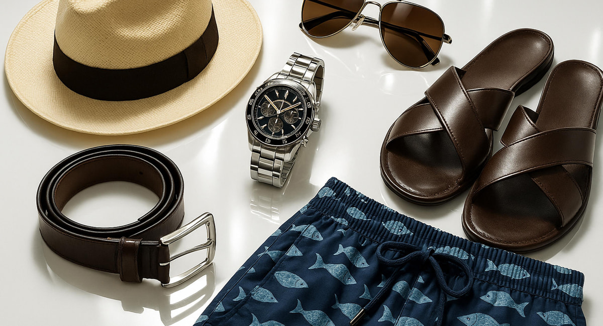




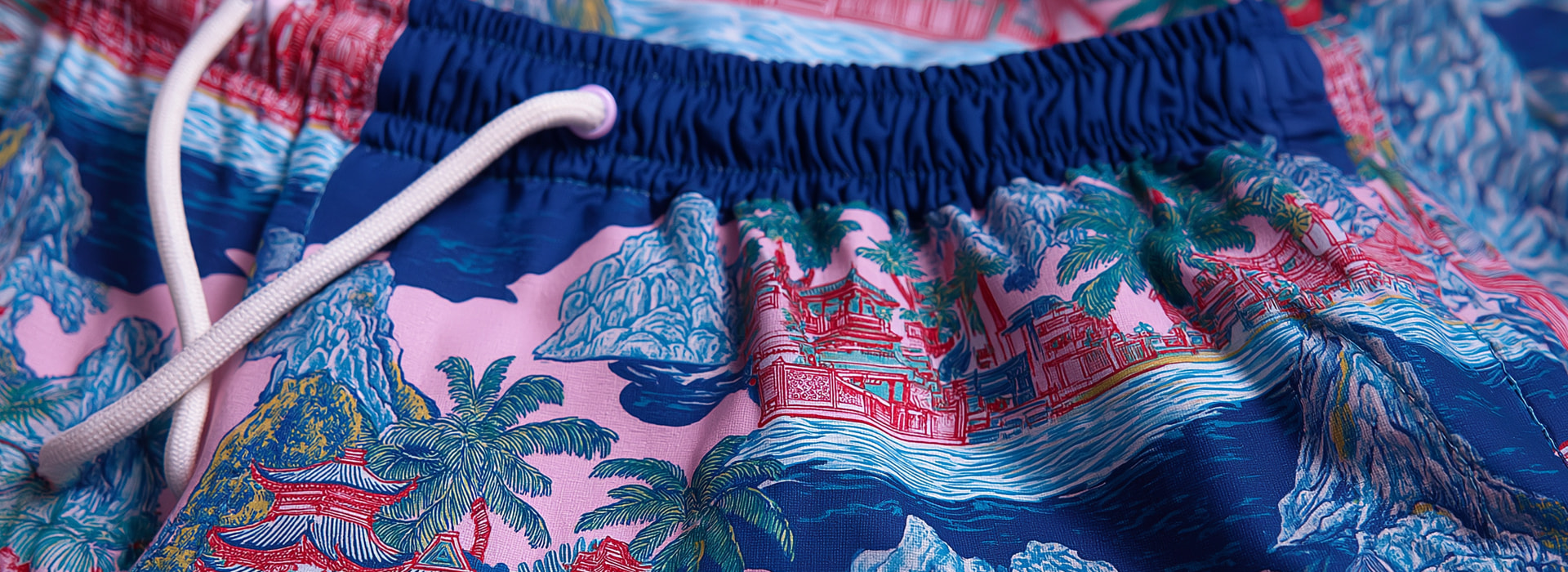
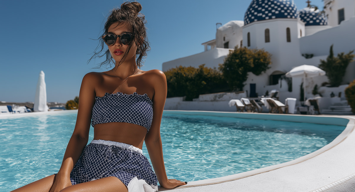


Through this emblem and its carefully considered visual language, the brand identity is established as a destination for the most exclusive swimwear brands, resort wear and luxury summer items. It does not simply define a store · it creates an experience that captures the luminous spirit of Mykonos and elevates it into a timeless symbol of style and luxury.
