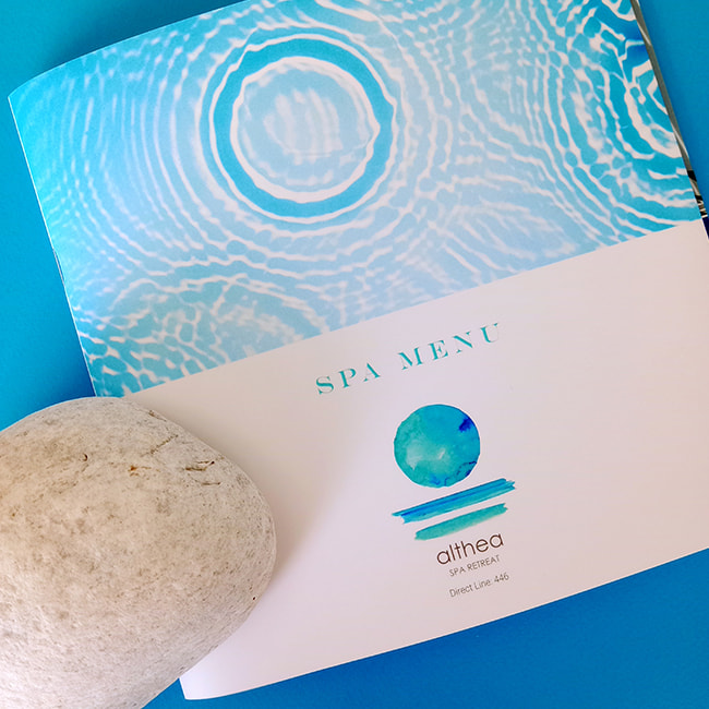
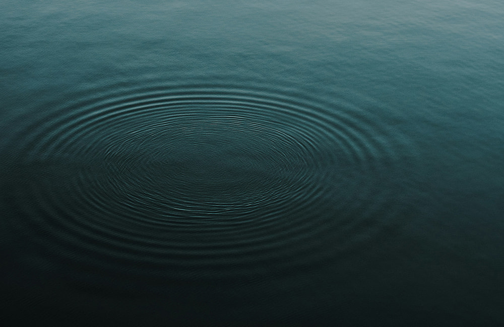
There is something deeply calming in the way color flows across water. That same rhythm, that same sense of breathing, is carried by the visual identity of Althea | SPA RETREAT – not as a simple mark, but as a moment of stillness captured in aquatic tones.
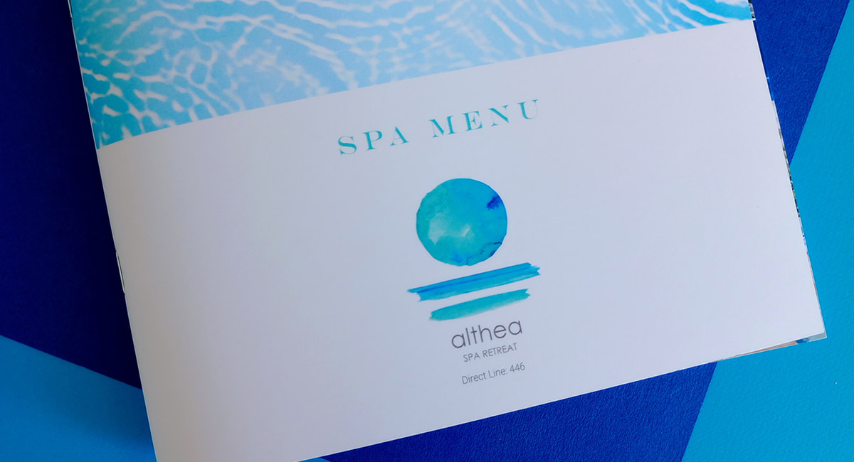
The watercolor circle, in shades of blue green, turquoise and sea blue, floats above two subtle brushstrokes.
It recalls the sun rising from the sea or the reflection of light on the surface of the water. The composition appears simple at first glance – yet it reveals much: sky, sea and horizon. The very elements of nature. And with them, the core of the experience offered by Althea: purity, presence and restoration.
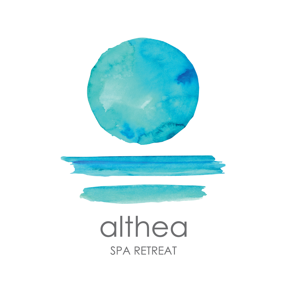
There are no harsh lines, nor symmetries that press the eye. The free, almost spontaneous form of the design speaks of a spa philosophy that respects natural flow and honors organic beauty. It does not impose itself – it invites you in. Each brushstroke is a breath. Each shade of blue, a pulse of clarity.
The name “althea”, written in clean, understated lowercase letters, adds a sense of calm and humility. The typeface is contemporary without feeling cold; refined without affectation – exactly like the spa’s approach to wellness: rooted in simplicity, guided by care and focused on inner harmony. The phrase SPA RETREAT, placed discreetly beneath the name, acts as a grounding element – a gentle reminder that this is not merely about services, but about a space of retreat, restoration and serenity.



More than an identity, the logo functions as an entrance to an experience. It prepares you for a place where time slows down. The senses awaken. It does not push you forward – it brings you back to yourself.
And within this raw, luminous, aquatic circle, the entire philosophy of Althea Spa Retreat is revealed: healing through simplicity, beauty through flow, peace through presence.
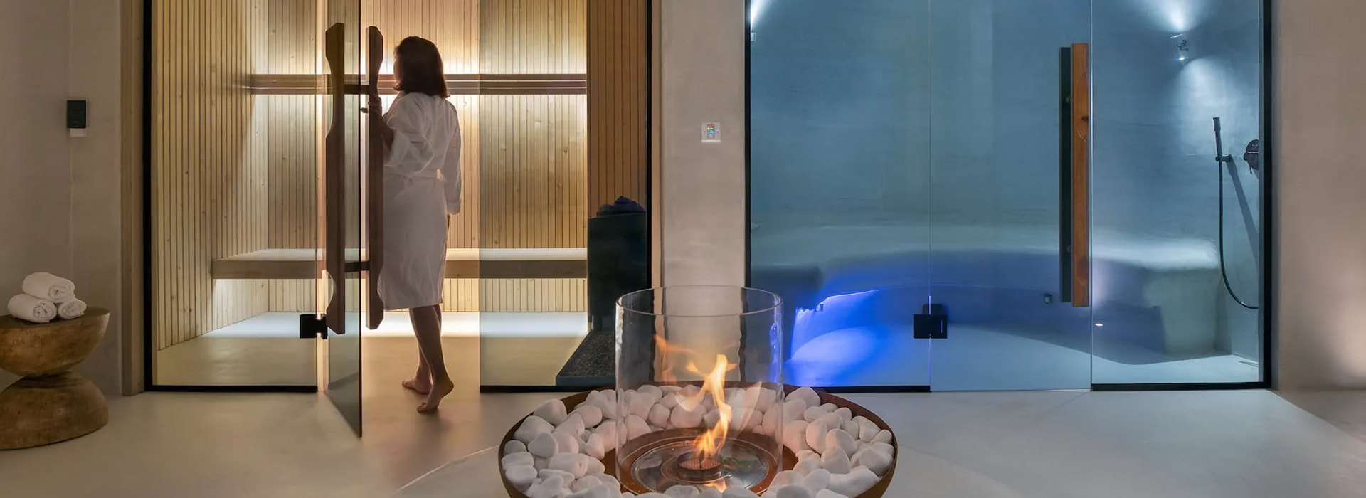
The catalogue of Althea Spa Retreat in Mykonos draws inspiration from ancient Greek heritage, as the name Althea refers to the timeless concept of healing and renewal.
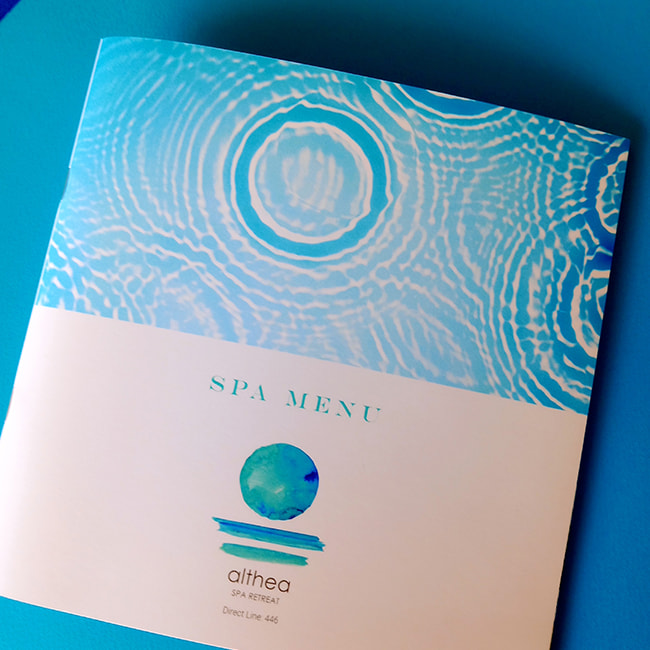
The name originates from the ancient Greek verb “althaino” or “atho,” meaning “to heal, to cure,” linking tradition with contemporary wellness. The catalogue cover is inspired by the circular movement of water, using soft blue and green tones that echo the natural rhythms of the sea. Wave and circular patterns convey a sense of continuous flow and rebirth, creating an atmosphere of calm and connection with nature.
The printed piece is designed to offer guests a refuge of calm, embodying the essence of Althea Spa Retreat through its connection with water and the timeless value of healing. The elegant layout and visual harmony of the catalogue create an experience that encourages guests to embrace the power of nature and discover the essential impact of water on their overall well being.
