At first glance the golden emblem captures the eye with its geometric precision and harmonious symmetry like a calm ripple that conveys a sense of movement through the simplicity of line. The abstract representation of the letter Z with curves subtly merging with strict angles unfolds like a silent promise of hospitality. The form appears to hover between calm and dynamism a symbol that does not shout but declares stability continuity and an experience that flows naturally – exactly as hospitality should be in a space that respects time and the visitor. It is not merely a letter · it is an archetype of welcome a geometric greeting with character and identity.
The choice of the gold – bronze shade is not merely aesthetic · it is essential with depth and meaning. It does not express showy luxury but a timeless character subtle and stable rooted in the Greek idea of hospitality: refined without excess accessible without losing its sense of dignity. It is the color of light as it sets over the city’s neoclassical buildings of the memory of a fine dinner in an elegant roof garden of the quiet confidence inspired by an environment cared for down to the last detail. It is the sheen of bronze on the handle of an old Athenian door · it is the glow of a first impression that lasts.
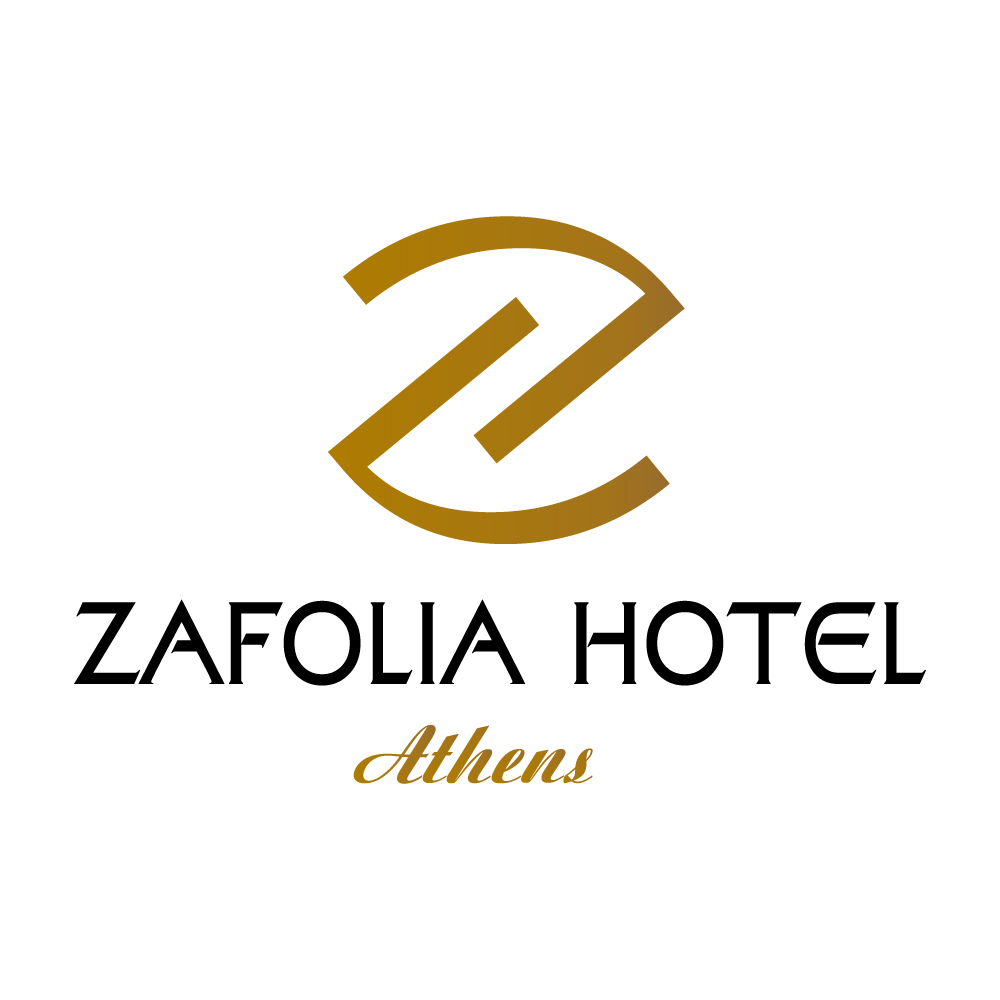
This sense is reinforced by the name ZAFOLIA HOTEL written in a modern geometric typeface that is clean but not cold with minimal refined artistic details in letters such as A and E that add character and identity. There is care and intention behind every detail: nothing is accidental nothing is excessive. The uppercase letters convey prestige and stability like a voice that states its presence with politeness and confidence while the deep black color grounds the elegance with clarity and definition acting as a counterbalance to the golden glow of the emblem.
And as the eye moves downward it meets the word Athens written in gold in a calligraphic fluid style like a discreet signature at the end of a letter or a personalized invitation. It is the detail that brings the city into the brand – not only as a location but as a feeling as a culture as a scent. This lettering adds a more personal dimension a sense of cosmopolitan finesse that speaks to the visitor on a human level like a quiet voice that says: “you belong here” “here you can rest breathe and feel at home even if you are miles away from it”.
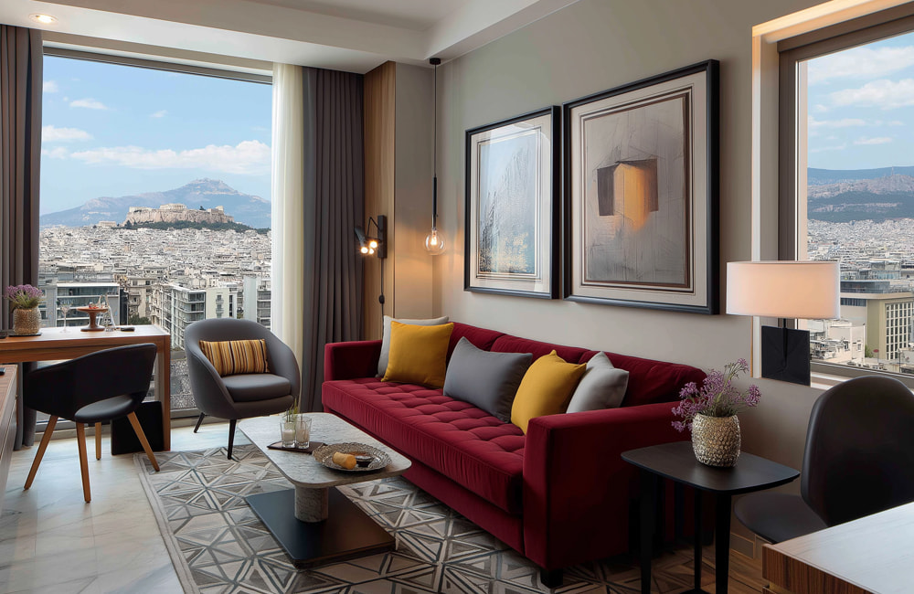
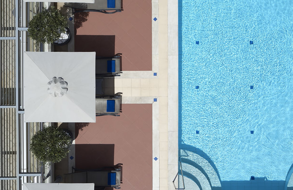
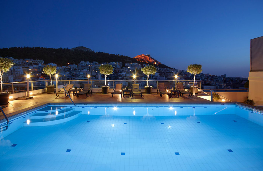
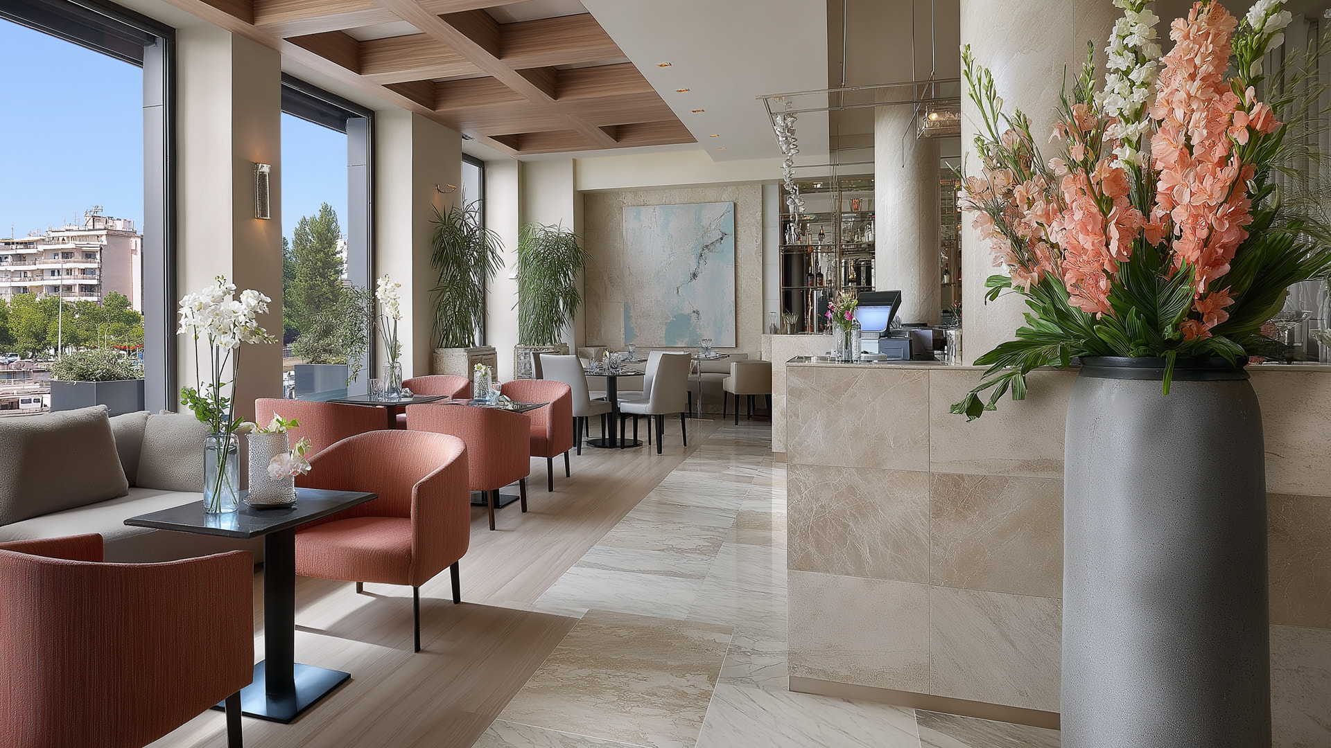
The logo as a whole does not function merely as a visual identity but as a carefully crafted narrative a contemporary visual poem that sensitively captures the experience offered by Zafolia Hotel. It does not seek to impress through excess but succeeds in remaining memorable through the wisdom and subtlety of its character. It is a logo that masterfully balances rigor and humanity order and flow the global and the local. It is international but with a Greek soul · elegant but welcoming · simple but full of meaning. It is an aesthetic statement that goes beyond design and extends to the very essence of the hospitality experience – an experience that is thoughtful authentic stylish respectful and marked by a rare sense of calm that lingers.
