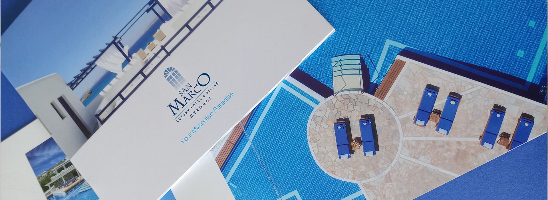
Every hotel has its own image. Few, however, have their own narrative. The brochure of San Marco Luxury Hotel & Villas in Mykonos was created not to speak about the place, but to be wrapped in its aura. It was not designed to impress, but to gently set the mood without noise.
From the very cover, nothing feels rushed. The eye rests on surfaces that seem to breathe – white walls, soft shading, a sky with no beginning or end. Simplicity is not a stylistic choice; it is a way of thinking. And this is what translates onto the pages.
The brochure does not present the hotel as a catalogue of services. It tells its story – as if someone were whispering an experience they once lived there, a sunlit morning, a perfectly quiet arrival, a view you could not forget even after returning home.
The hotel’s architecture is reflected with honesty in the layout: clean geometries, strict symmetry and surfaces that give space to the eyes and to the air. Each page functions like an inner courtyard. Nothing is excessive – and nothing is missing.
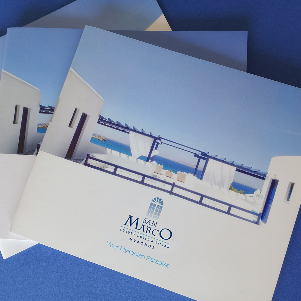
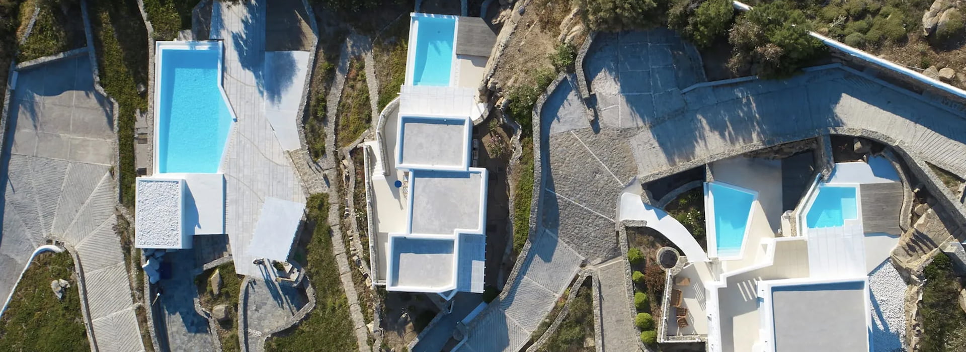
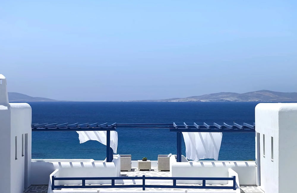
The images do not challenge you. They invite you in. They are captured in a way that does not place you as a viewer, but allows you to stand within them. A frame overlooking the pool, a half drawn white fabric letting the light pass through, a corner with a blue window and the shadow of a Cycladic pergola – all designed not to impress, but to awaken a sense of presence.
The typography is clean and low key. The words are measured. The captions play a supporting role, almost poetic. They do not explain. They quietly point the way. Just like the hotel itself, the brochure operates with respect for the visitor’s time. It does not impose itself – it simply exists.
As the reader turns the pages, they do not simply learn. They synchronize. With the rhythm of an island that knows how to offer without shouting, with a hospitality experience that has shed every unnecessary weight. And when the final page is reached, it does not feel like closing an informational brochure. It feels like having already been there.
The San Marco Mykonos brochure is not a “luxury brochure”. It is an object that functions like a memory before the memory exists. Like a space to breathe. Like a promise written in blue ink and white margin.
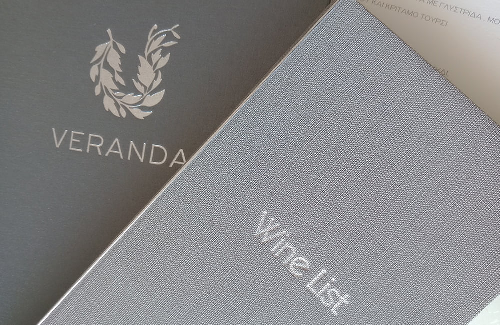
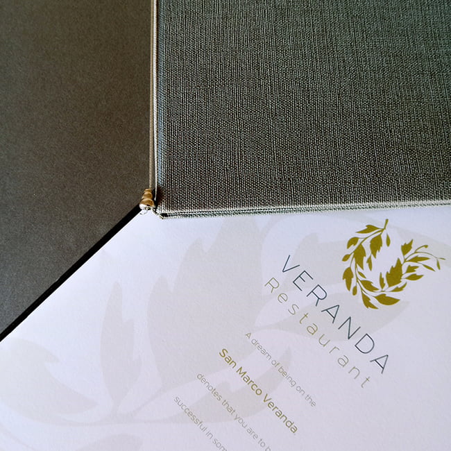
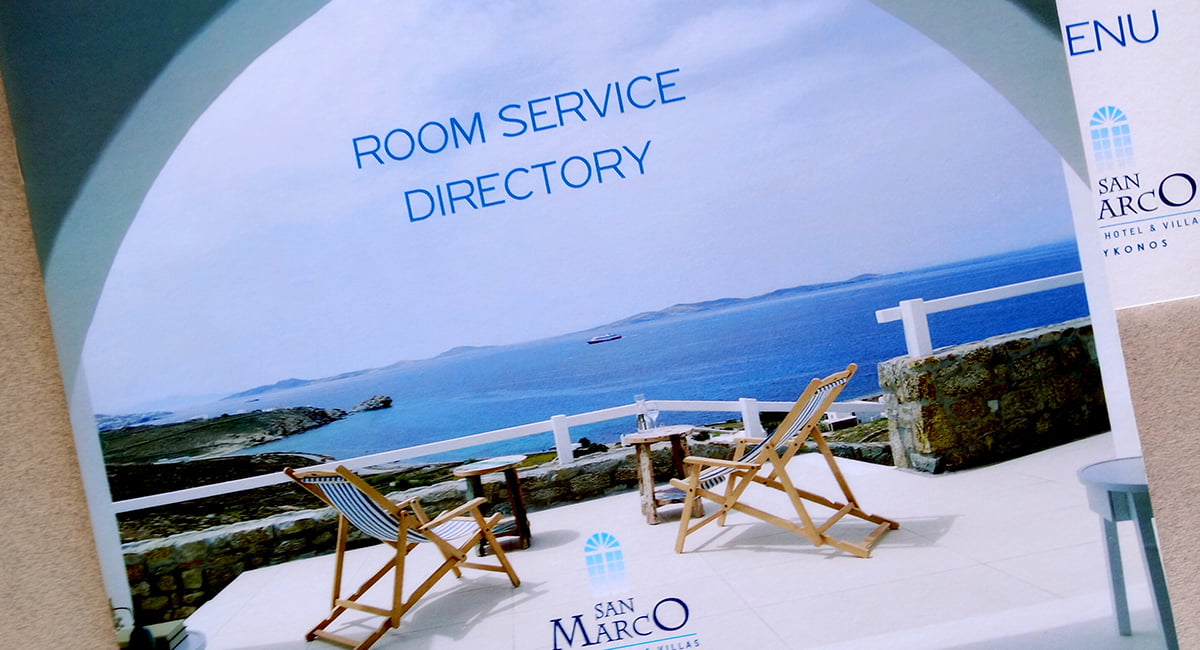
The design of the catalogues for the Veranda restaurant at San Marco Hotel & Villas is based on elegance and carefully considered detail.
The outer cover is made of high quality canvas in shades of grey, conveying a sense of timeless luxury. The hotel’s logo is embossed using the embossing technique and finished with silver foil, creating a subtle yet striking shine. The titles “Menu” and “Wine List” are also presented in silver foil, set in an elegant, minimal typeface.
The interior layout is defined by a clean and restrained appearance, with ample white space that ensures ease of reading. Dishes and wine categories are carefully organized while, for a complete premium look, the corners of the catalogue are finished with metallic silver protectors. The overall result is completed with small details, such as a thin silver ribbon bookmark and discreet logo watermarks on each page.
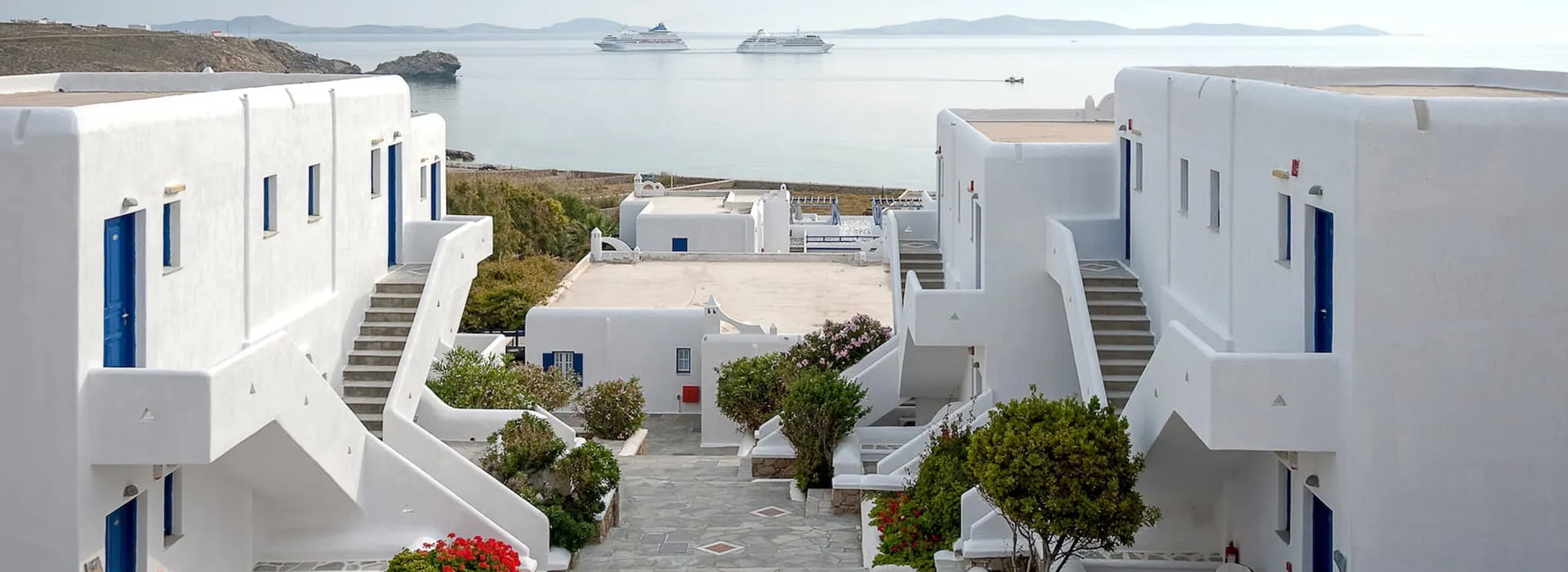
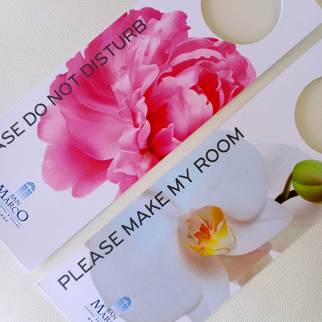
The brand identity focuses on the relationship between light and simplicity. The choice of the color palette – with tones of white, sky blue and natural Cycladic shades – is intrinsically linked to the island’s architecture. The hotel’s logo, with its semicircular references to domes and the sun, functions as a symbol of brightness, calm and authenticity. It is contemporary, yet respectful of its roots. Every element of the printed and physical branding – from welcome cards and informational signage to in room notes and accompanying details – conveys kindness, care and lightness. The flowers that frame the visual material are not merely decorative; they act as a personal gesture toward the guest, suggesting a hospitality experience that is not mass produced, but deeply human and thoughtfully curated.
The use of clean, white surfaces across all design applications leaves room to breathe. The guest feels that the space – and the brand – does not overwhelm, but embraces them. This lightness in design, combined with high quality photography and elegant typography, forms an identity that is discreet yet unforgettable.
The corporate identity of San Marco does not seek to impress through spectacle; it chooses the path of inner balance and aesthetic consistency. The result is a holistic experience that begins with the first visual contact and is completed within the space, the light, the behavior of the staff and the quality of hospitality. San Marco Mykonos Luxury Hotel & Villas is not promoted – it breathes. And its corporate identity is the first quiet, yet deeply meaningful, greeting to the guest.
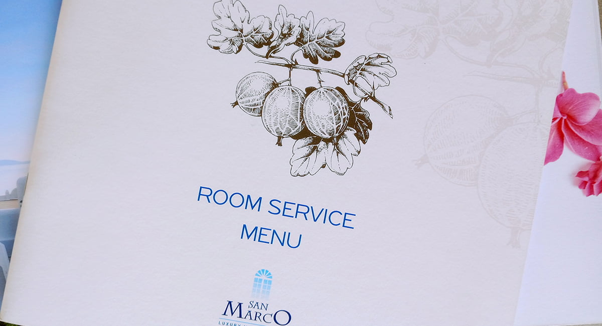
The Room Service Menu and Directory printed materials for San Marco Hotel Luxury Hotel & Villas focus on information and the hotel’s amenities. With minimal design, earthy tones and refined typefaces as dominant elements, the materials convey harmony and discreet luxury. The use of high quality paper and subtle embossed details enhances the hotel’s premium identity, while the overall aesthetic reflects the elegant environment and the unique hospitality offered by San Marco Hotel.
