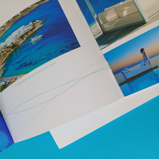
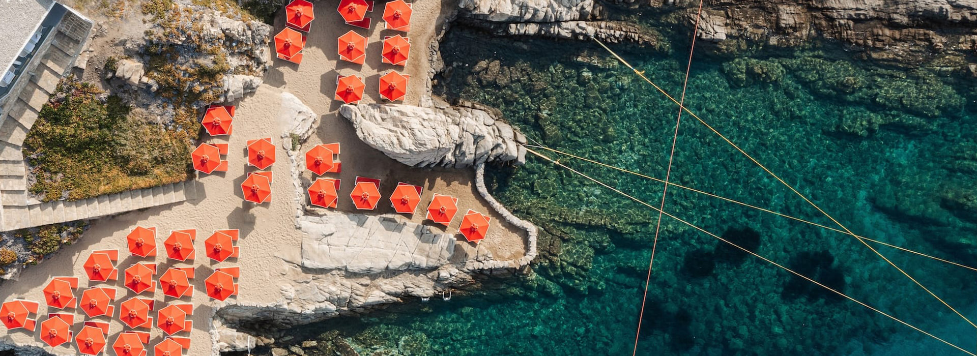
Where the soft blue of the Aegean meets the silence of elegance and the white of Mykonos becomes light that embraces the gaze, a world unfolds – created to calm, to balance and to inspire. Petasos Beach Resort & Spa, nestled in the golden bay of Platis Gialos – the island’s most cosmopolitan and renowned beach – is not simply a hotel. It is a microcosm of experiences, a carefully designed environment where luxury coexists with serenity and beauty is expressed through the simplicity of nature and the balance of architecture.
This very spirit is subtly embodied in the resort’s visual identity. The logo of Petasos Beach Resort & Spa is an ode to the elegance of the marine world. Two seahorses, upright and symmetrical, meet at the center of an organic composition that evokes seabed plants, the movement of currents and the breathing of the sea. It is not merely a decorative motif. It is a symbol inspired by the very environment that surrounds and defines the character of the hotel.
The seahorse, an almost mythical creature, is associated with harmony, grace and gentleness. Rare and quiet, it becomes here the bearer of a deeper meaning: release, mindful movement and a form of luxury that does not shout, but whispers. It is the ultimate symbol of the resort, because it embodies the discreet strength of the experience it offers: hospitality with subtlety, aesthetics with meaning and luxury with substance.
The clarity of the design reflects with absolute consistency the architecture and spatial experience offered by Petasos: white Cycladic forms, pastel tones, unobstructed sea views and natural light that floods every corner. There is no unnecessary information – every choice, from geometry to the color palette, supports the philosophy of wellness and complete balance.
The logo itself functions as an introduction to this experience: the first glance that sets the tone, the first promise that is kept. It is not a logo that seeks to impress with flashy graphics, but a symbol that speaks to the consciousness of the modern traveler – one who seeks inner calm, refined aesthetics and an authentic connection with the landscape.
Petasos Beach Resort & Spa does not simply present luxury as status. It expresses it as a daily act of care. From pools that embrace the sunset to the details of the spa and the architectural lines that guide the eye toward the endless blue, every element offers a true sense of breathing space, meaningful release and carefully curated harmony.
And so, the logo becomes far more than a point of recognition. It becomes a symbol of the experience, the expression of a philosophy of life that begins with the element of water and leads to something much deeper:
the art of living quietly, beautifully and with meaning – within and beyond.
In a world overloaded with information, true luxury is silence that has something to say. The brochure of Petasos Beach Resort & Spa in Mykonos is not limited to a presentational role. It is a refined form of dialogue, a way to approach the resort experience not through descriptions, but through atmosphere, light and rhythm.
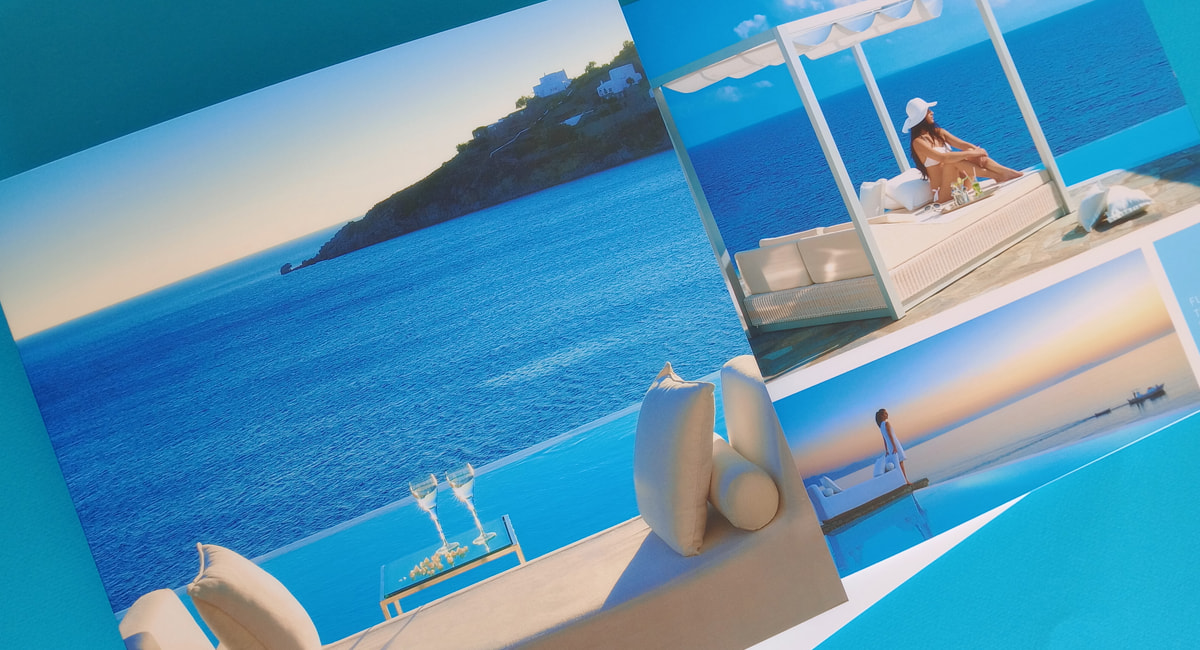
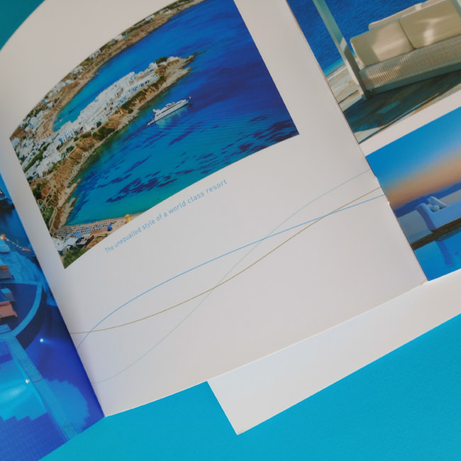
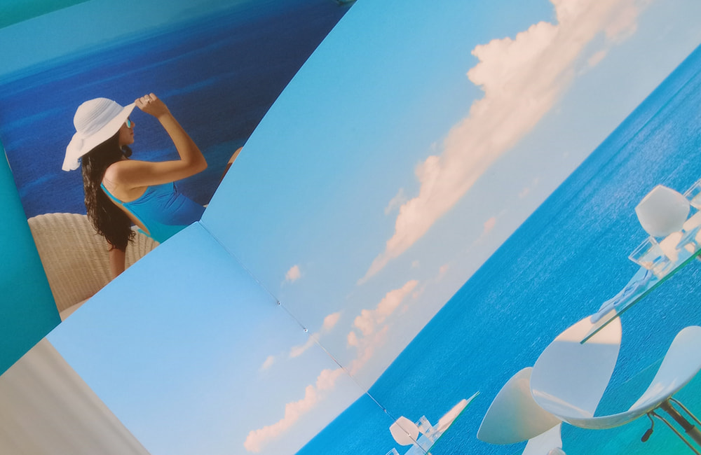
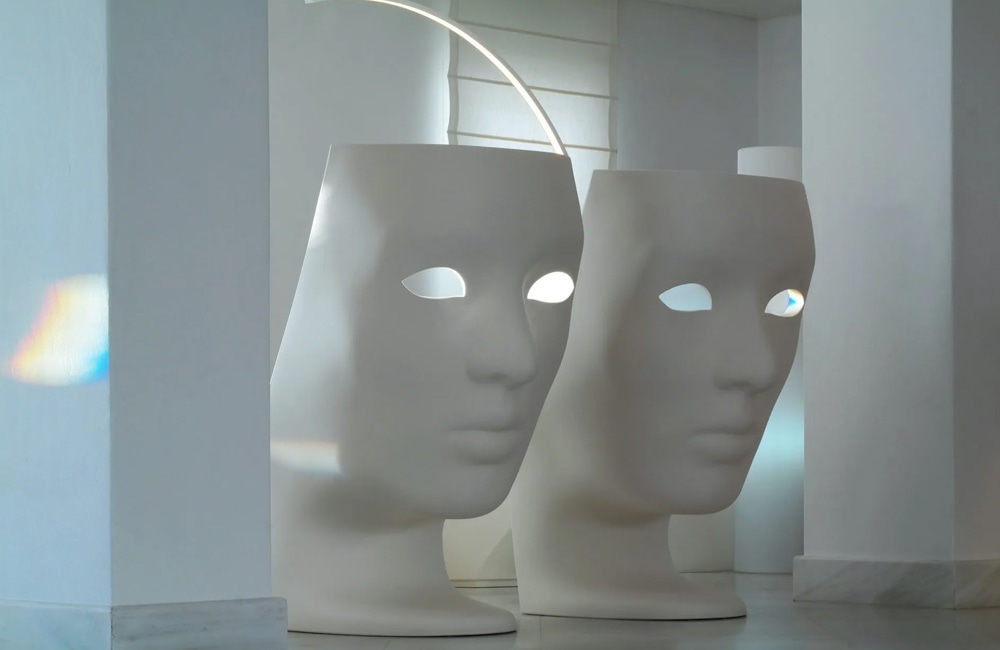
From the very first page, it becomes clear that this is something more than a stay guide. This brochure was designed to function as an immersive object of experience. It balances information with aesthetic harmony, functionality with emotion. It does not simply speak about the “where”, but suggests how you will feel when you are there.
The choice of imagery is not promotional, but almost cinematic. Each photograph is a mood frame: a glimpse of the sea without a horizon, a white hat catching the light, a table for two in the shade of the Aegean. The compositions are silent; they function like snapshots of holidays that have not yet happened – yet already linger in memory.
The design is based on clarity and calm. Clean colors, full breathing photography, generous margins and discreet typography create a reading rhythm that feels more like wandering than paging through. The reader does not “read” the brochure. They inhabit it.
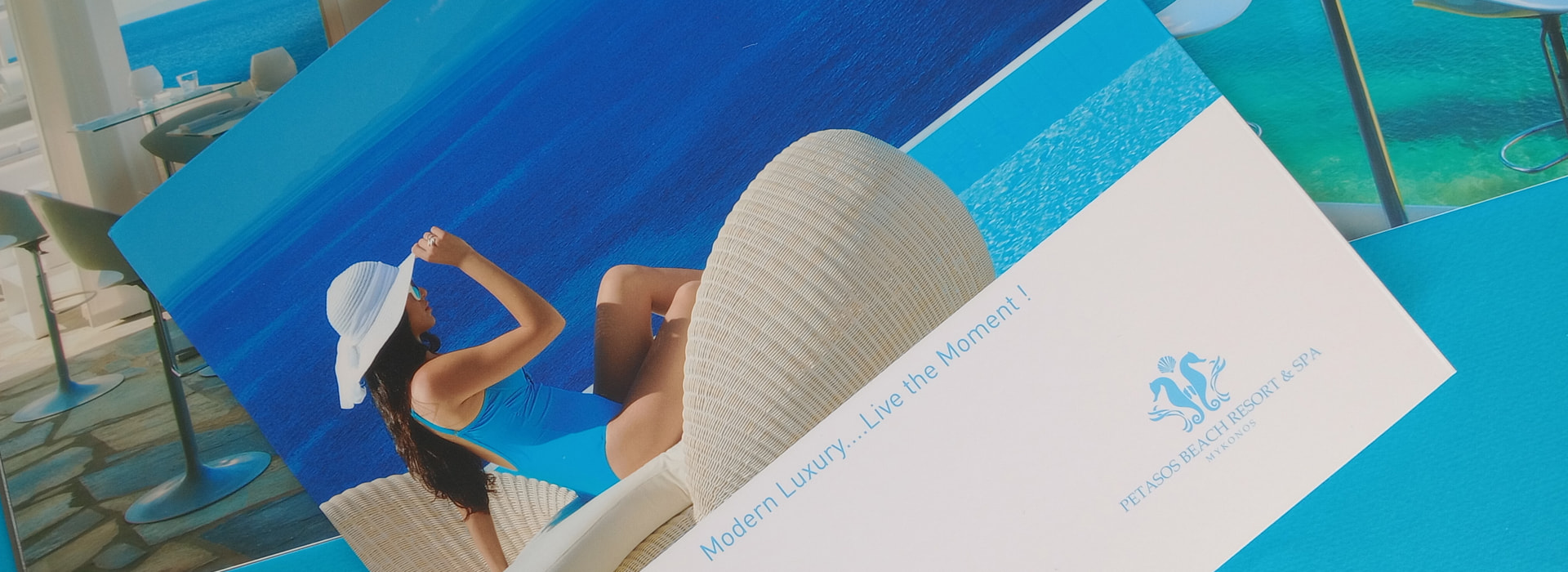
The typography does not seek to impress; it chooses the grace of understatement. The words do not describe – they suggest: Feel the horizon. Let time slow. Step into silence. Short phrases, yet precise. Without excess, without grandiosity. Simply with complete control of tone and mood.
The palette is rooted in natural materials and colors: the blue of the sea, the off white of stone, the transparency of light, the matte texture of sand. The pages function as an extension of the space – as if touching the warm shade of a wooden pergola or the cool linen of an interior lounge.
The design of the printed materials for Petasos Beach Resort & Spa does not seek to persuade. It seeks to align.
The visitor with the rhythm of the island. The reader with the promise of the place. Time with sensation. And it achieves this not through abundance, but through cohesive simplicity and aesthetic intelligence.
On every page, the experience of hospitality emerges not as a service, but as an inner proposition of being. Petasos does not merely promise rest. It offers restoration. And its brochure functions as a ritual introduction to this experience – an object that does not inform you, but prepares you.
A place of high aesthetics requires printed materials that do not shout, but remain silent with confidence. This is exactly what the design of Petasos achieves: to convey precisely what it promises. Not “luxury” as a word. But as a feeling.
