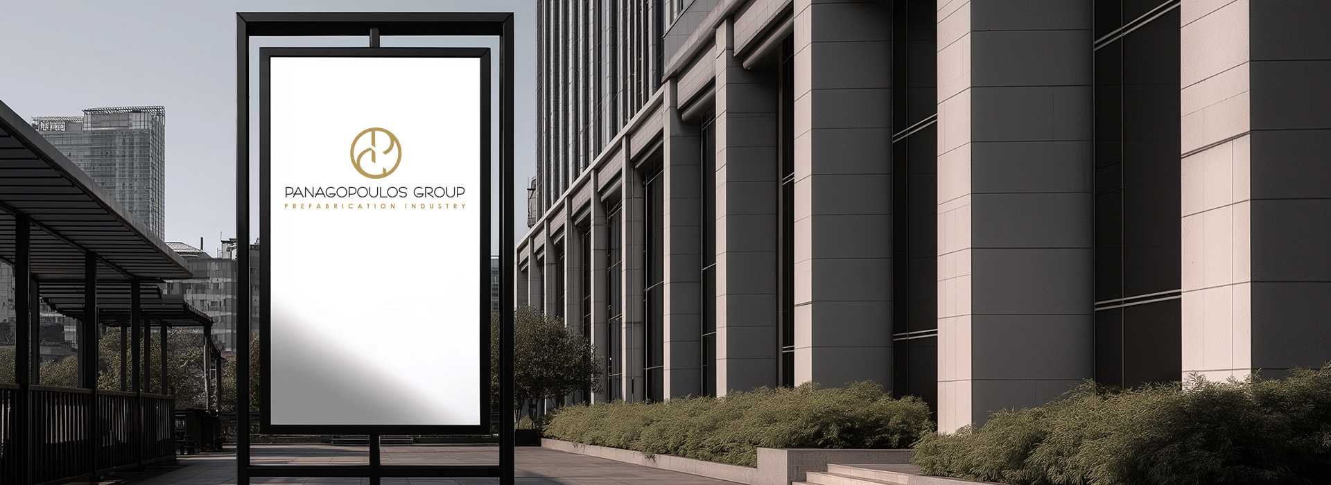
Innovation is not expressed only through projects, but also through the way one presents themselves to the world. The logo of Panagopoulos Group, a company with a long-standing presence in the field of metal constructions and the prefabricated structure industry, perfectly embodies its essence and vision: structure, strength and progress.
At the heart of the design stands an abstract, symmetrical path that incorporates the initials “P” and “G” within a single circle. The result is a dynamic visual symbol ∙ the “P” and “G” do not simply coexist side by side, but interact, complement each other and create structure and continuity — just as in the company’s projects, where design and implementation coexist in perfect harmony.
The geometric balance and clean lines reflect the technical perfection and precision that define every stage of production – from the initial design to the final implementation. The logo speaks the language of construction ∙ with stability, symmetry and mechanical clarity.
The choice of the metallic golden-brown color is not accidental. It carries the warm promise of trust and reliability, while emphasizing the earthy, practical nature of the raw materials managed by Panagopoulos Group. The color evokes metal, ground, foundation – all the elements upon which future infrastructures are built.
The typography, minimal and modern, with elegant proportions and high readability, supports the professional character of the brand. Subtle yet confident, it reinforces the identity of a company that relies not on exposure, but on quality, consistency and results.
The overall visual identity functions as a guarantee of stability. It conveys the timeless seriousness of a construction philosophy that respects the art of building while confidently looking toward the future. Panagopoulos Group is not merely an industrial unit ∙ it is a hub of expertise and applied experience, and its logo reflects that — with clarity, architectural consistency and timeless aesthetics.
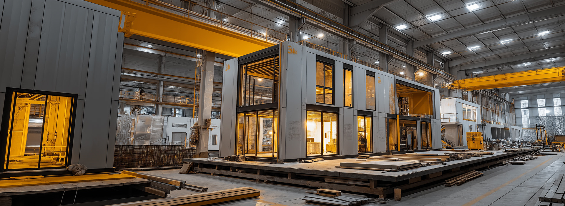


The corporate identity of Panagopoulos Group was designed to clearly express the dynamism, consistency and timelessness of a group active in the field of industrial prefabrication, characterized by technological excellence and deep expertise. The overall visual direction goes beyond aesthetic perfection ∙ it functions as a strategic communication tool that embodies the company’s values and conveys them consistently across every point of contact with its audience.
The logo is based on a strictly geometric approach, centered around an abstract monoline emblem inspired by the initials of the brand name. The placement of the symbol within a circle is not accidental ∙ the circle represents completeness, stability and continuous evolution — qualities that reflect the philosophy of the group. The simplicity of the emblem’s lines is reinforced by the strength of the selected color palette: black and white create strong contrasts and clean surfaces on which the metallic gold tone of the logo stands out. The choice of gold is not decorative but deliberate ∙ it conveys a sense of reliability, prestige, timeless value and high-standard professionalism.
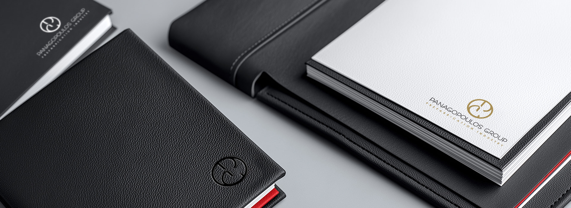
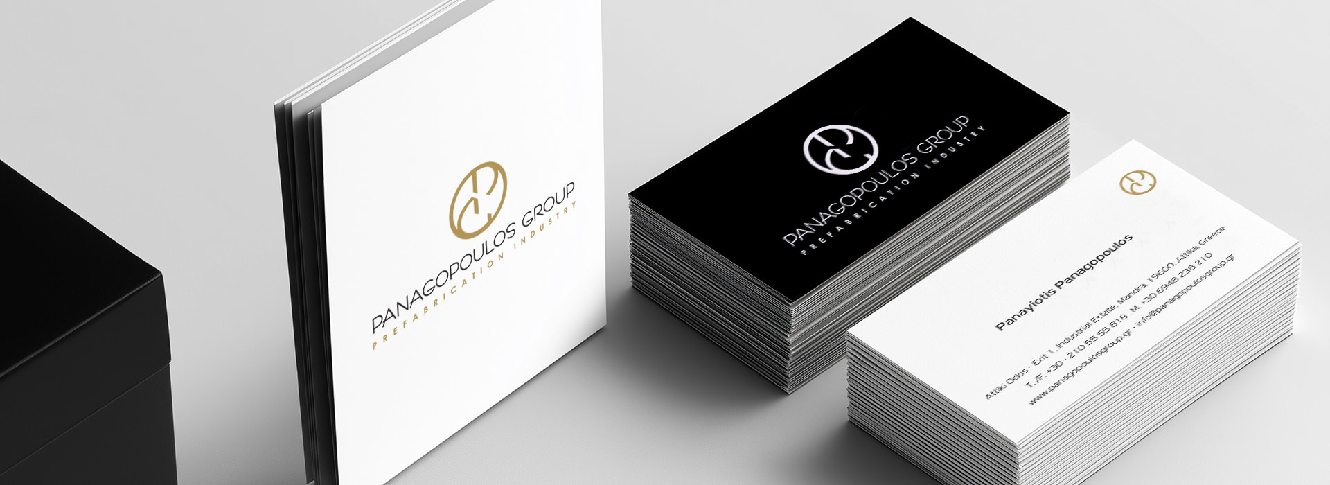
The typography that accompanies the emblem has been carefully selected for its clarity and readability, free from unnecessary flourishes or “graphic ornaments.” It conveys seriousness and precision, allowing the logo to lead the composition without creating conflict or visual overload. In print applications, the use of secondary embossing (blind logo or watermark) adds a multi-layered narrative without detracting from the functionality of the materials.
The applications of the corporate identity — from business cards and folders to letterheads, internal communication materials and presentations — consistently follow a unified design system that reinforces the brand’s cohesion and professional integrity.
The folders with dual color contrast, the internal documents featuring the logo in a subtle gray tone, and the overall layout give the group’s image a sense of structure, clarity and technical precision — core elements that also define its operations.
The new visual identity of Panagopoulos Group goes beyond the rhetoric of modern branding. It expresses something deeper ∙ an identity with a solid foundation and a clear purpose, capable of standing confidently in both the domestic and international markets. It is a design that does not seek impressions but builds trust. It creates bridges between tradition and innovation, expertise and strategy, affirming that the image of a group can — and should — serve as an extension of its very essence.
