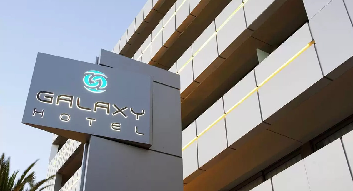
The logo of Galaxy Hotel Iraklio represents a contemporary geometry of luxury — a creative composition that encapsulates the hotel’s entire philosophy within a single, artistically balanced form. At its center are two mirrored “G” letters — not merely the initials of the name Galaxy, but symbols of a circular relationship of hospitality, a continuous flow between guest and experience.
The two Gs do not stand still. They rotate around each other, creating a dynamic, almost galactic motion that alludes not only to the hotel’s name but also to the cosmic phenomena of attraction, energy and connection. Just like in a real galaxy, every point has a purpose — and here, the guest becomes the center of a universe of care, aesthetics and experiences.
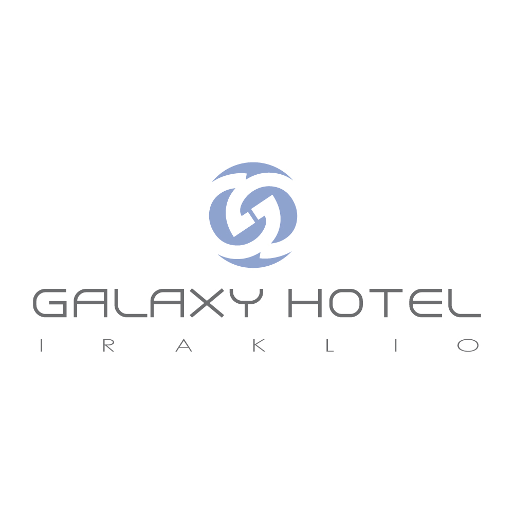

This circular form with its curved lines symbolizes continuity, movement and transformation, highlighting Galaxy Hotel’s commitment to hospitality that is not static but constantly evolving with the needs of its guests, while maintaining spatial harmony.
The choice of a cool, elegant blue evokes the serenity of the sea and the simplicity of the Cretan sky, serving as a reminder that here in Heraklion, nature, city and culture converge into an experience of perfect balance.
The typography that accompanies the symbol — thin, elegant and geometrically clean — emphasizes a sense of freshness and international prestige. The letters “GALAXY HOTEL” appear as if they belong to a modern observatory of the world — a place where earth meets sky, where the local meets the universal.
The logo of Galaxy Hotel Iraklio is not merely the signature of a hotel. It is an identity in motion ∙ a visual greeting that says: Here, at the center of our own galaxy, you are the brightest star.


