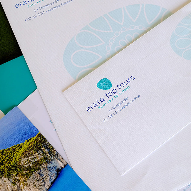
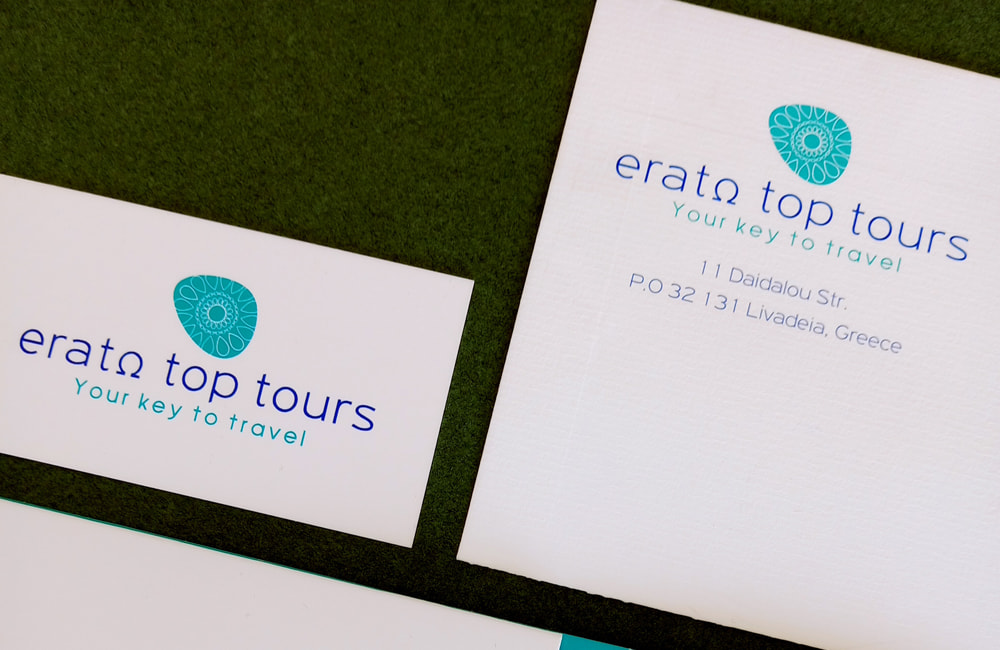
A corporate identity in the tourism sector is not merely a logo – it is the first promise of an experience. The logo of Erato Top Tours was designed with this principle at its core: to serve as a gateway into the world of travel, to express the company’s character through shape, color and typography and to convey values that transcend the commercial.
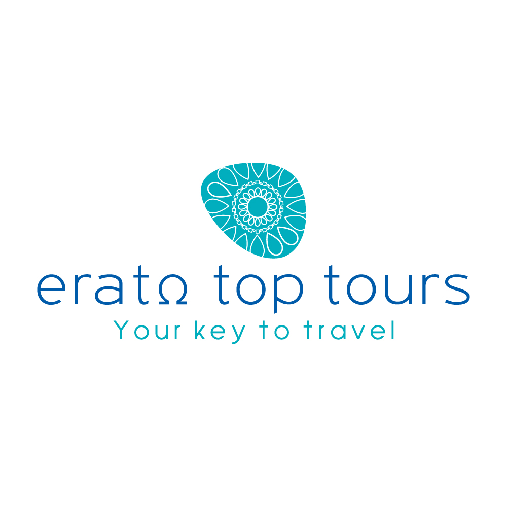
The symbol placed above the name resembles a pebble or a compass imprint, adorned with patterns inspired by nature and the cultural motifs of the Mediterranean. It is abstract, minimalist, yet rich in meaning. It represents the circularity of experience, the flow of travel and the individuality of each traveler, reminding us that every journey is unique.
The use of the letter “Ω” in “Erato” is not simply a design choice. It is a poetic nod to Greek heritage, connecting the brand with culture, art and the concept of completeness – the full circle of experience. The typography is clean, modern and approachable, with rounded lines that convey friendliness and reliability while maintaining elegance and professionalism.
The color palette moves in shades of blue and turquoise — colors that evoke the sky, the sea, freedom and clarity. These hues were not chosen merely for their aesthetic appeal; they represent calmness, safety, trust and stability — the core values that Erato Top Tours aims to offer every traveler.
The tagline “Your key to travel” serves as the perfect closure: a simple yet meaningful expression of the company’s mission. Erato is not just a travel organizer — it is the bridge between desire and experience, the guide to a journey free of stress, filled with confidence, care and professionalism.
The overall visual identity communicates the message of a company that blends a human-centered approach with modern efficiency — one that respects the dream of travel and turns it into reality.
The logo of Erato Top Tours does more than «represent» a company it builds expectations, inspires trust and invites travelers into experiences defined by quality, care and authenticity.
The corporate identity of Erato Top Tours is more than a set of design choices· it is the expression of a world made of experiences, emotions and journeys that transform travel into something truly unique.
The entire visual and communicative presence has been designed to inspire trust, set high expectations for quality and tell, from the very first moment, a story filled with freedom, care and exploration.
The logo — a modern, symmetrical emblem with references to classical harmony and authentic travel experience — exudes stability and elegance.
It is accompanied by the phrase “Your key to travel”, which serves as a promise: every destination becomes accessible, every desire finds its way to fulfillment. It is a key not only to the map but to the heart of every traveler.
The color palette has been carefully chosen to serve this mission: shades of blue that evoke the clarity of the sky and the Greek seas· soft tones that inspire emotional connection, calmness and security. The overall impression conveys care, consistency and professionalism — qualities reflected in every aspect of the service and experience offered.

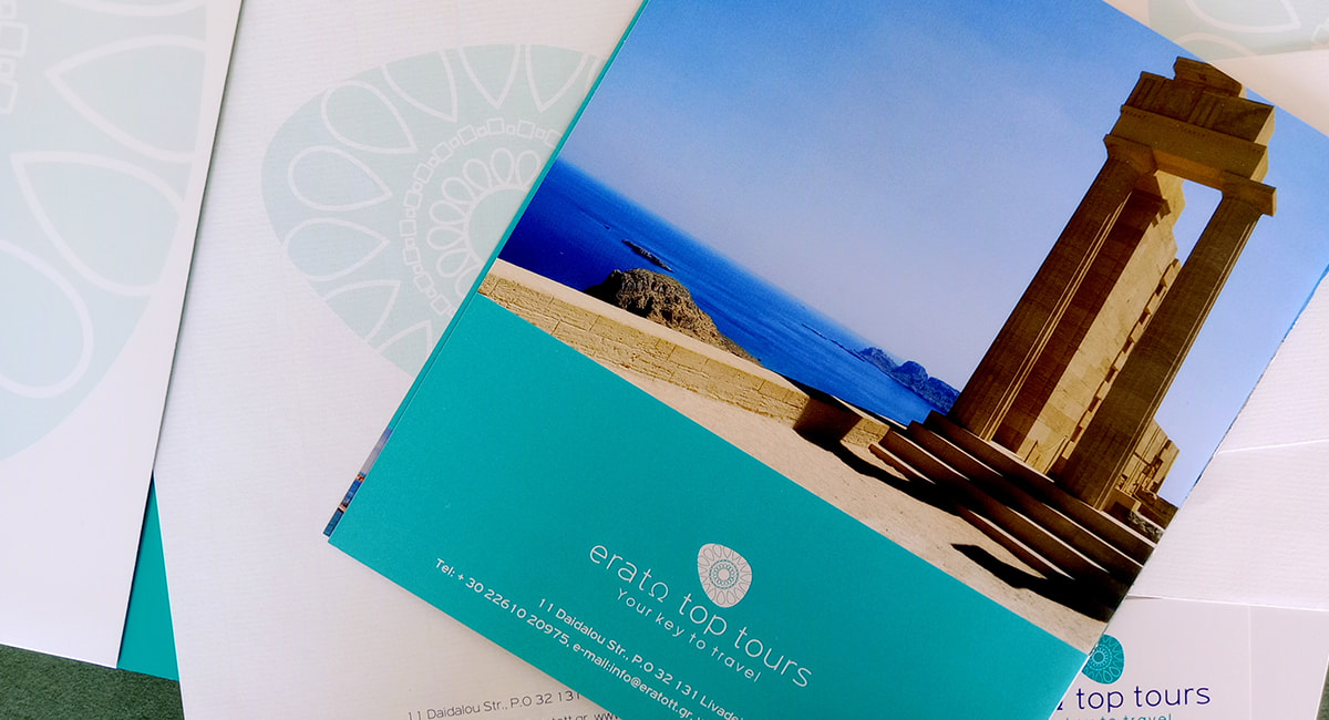
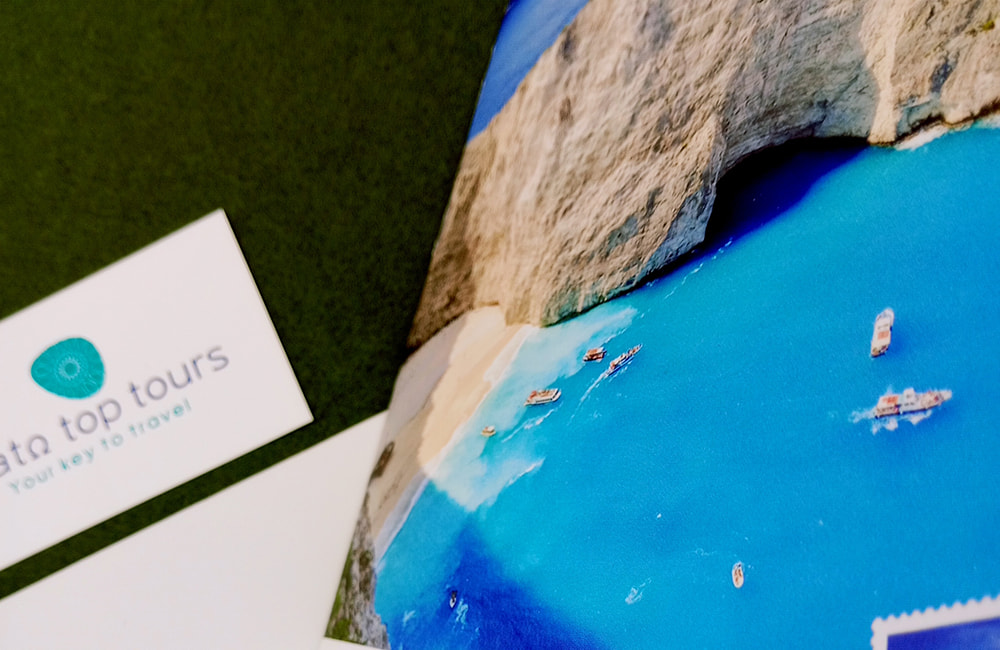
The identity of Erato Top Tours extends beyond design — it lives through the experience. It creates a narrative that connects with how the traveler feels before, during and after every journey. From the very first interaction with the brand — whether through a brochure, a website or an email — the overall aesthetic guides the eye and shapes a distinctive first impression: seriousness, care, professionalism and a genuine love for travel.
Erato Top Tours specializes in crafting complete travel experiences, tailored to the needs of a modern and discerning audience.
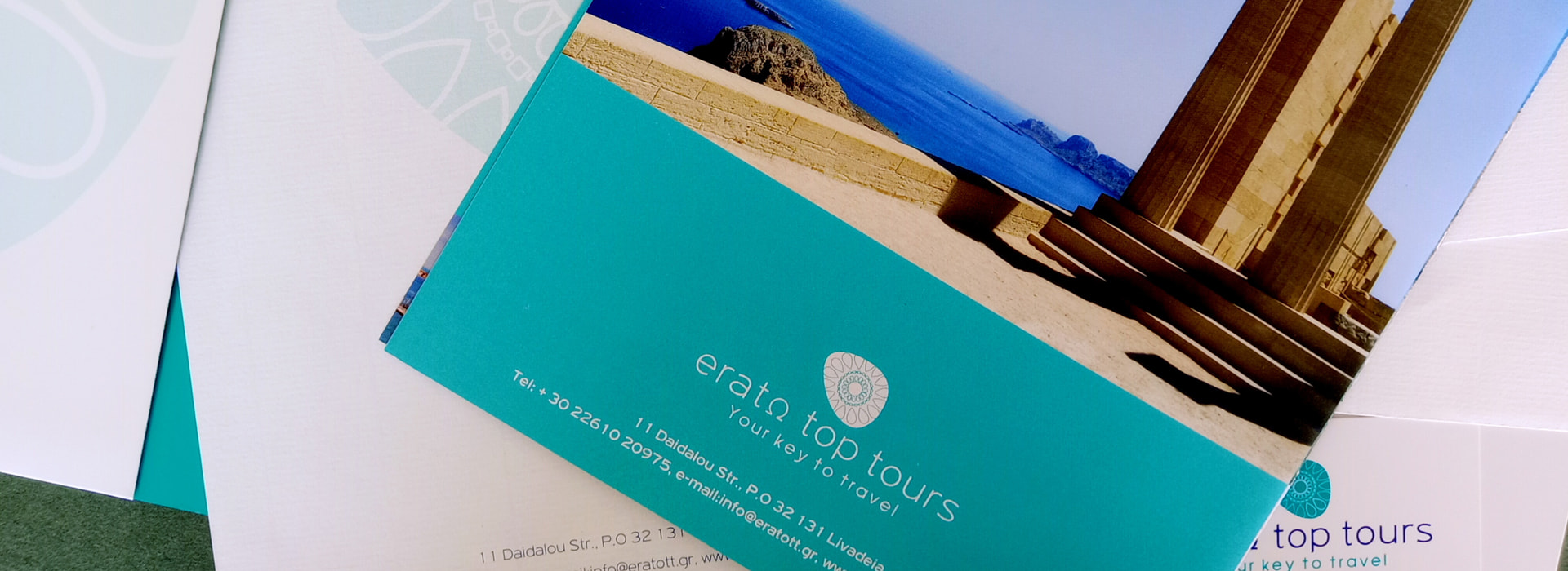
Its identity speaks to those who seek more than a simple travel package – it speaks to those in search of history, culture, nature, relaxation and connection. To those who want not only to arrive, but to feel.
The unified, consistent and harmonious image of the company, as expressed through every printed, digital or physical element, creates a brand that builds lasting trust.
It strengthens the relationship with the audience and establishes the company’s presence in the field of quality tourism – not merely as a service provider, but as an ambassador of experiences.
The corporate identity ultimately functions like every successful journey: it begins with a vision, continues with consistency and professionalism, and concludes with a sense of fulfillment.
Erato Top Tours transforms this journey into image, word, narrative and color – with one goal each time: to awaken the desire for the next journey.
